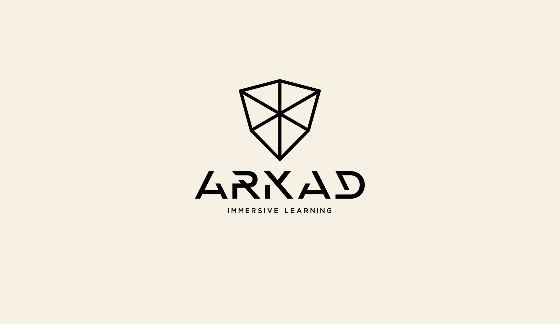
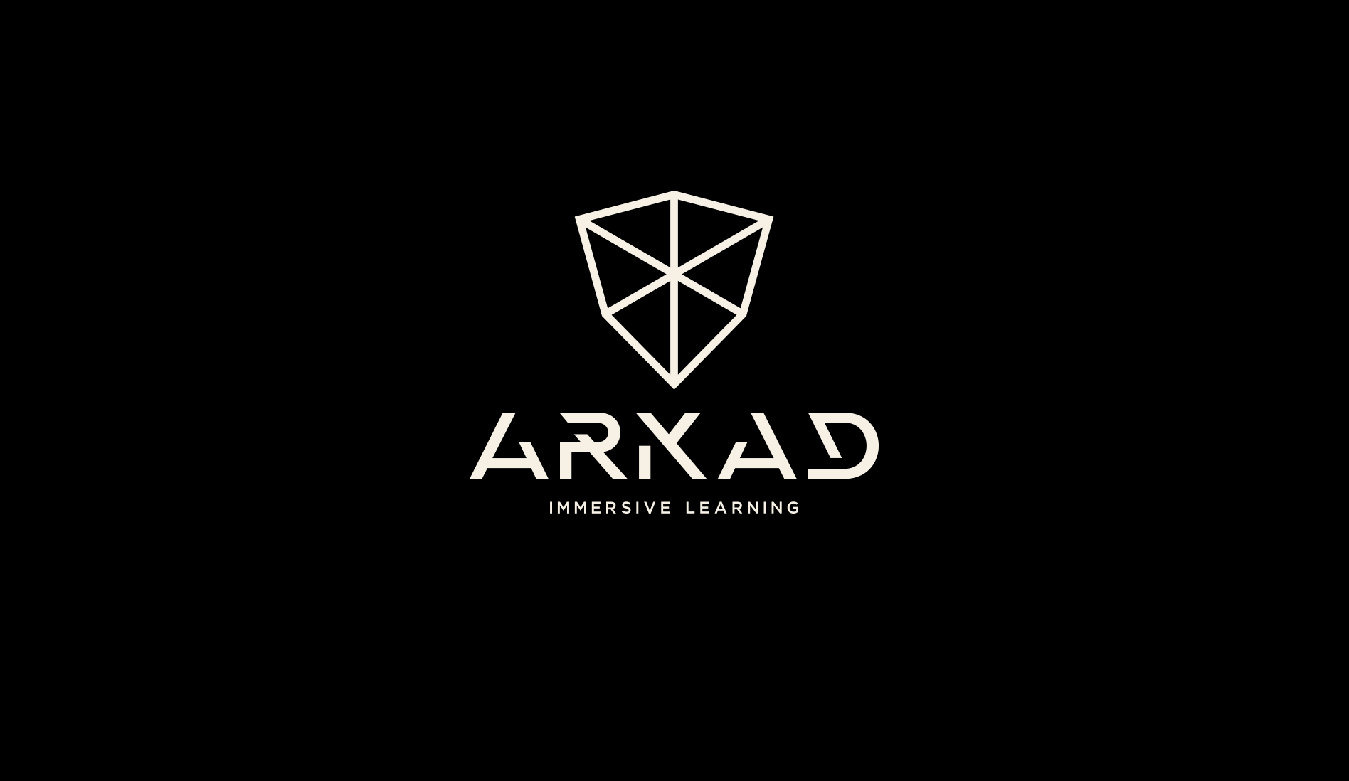
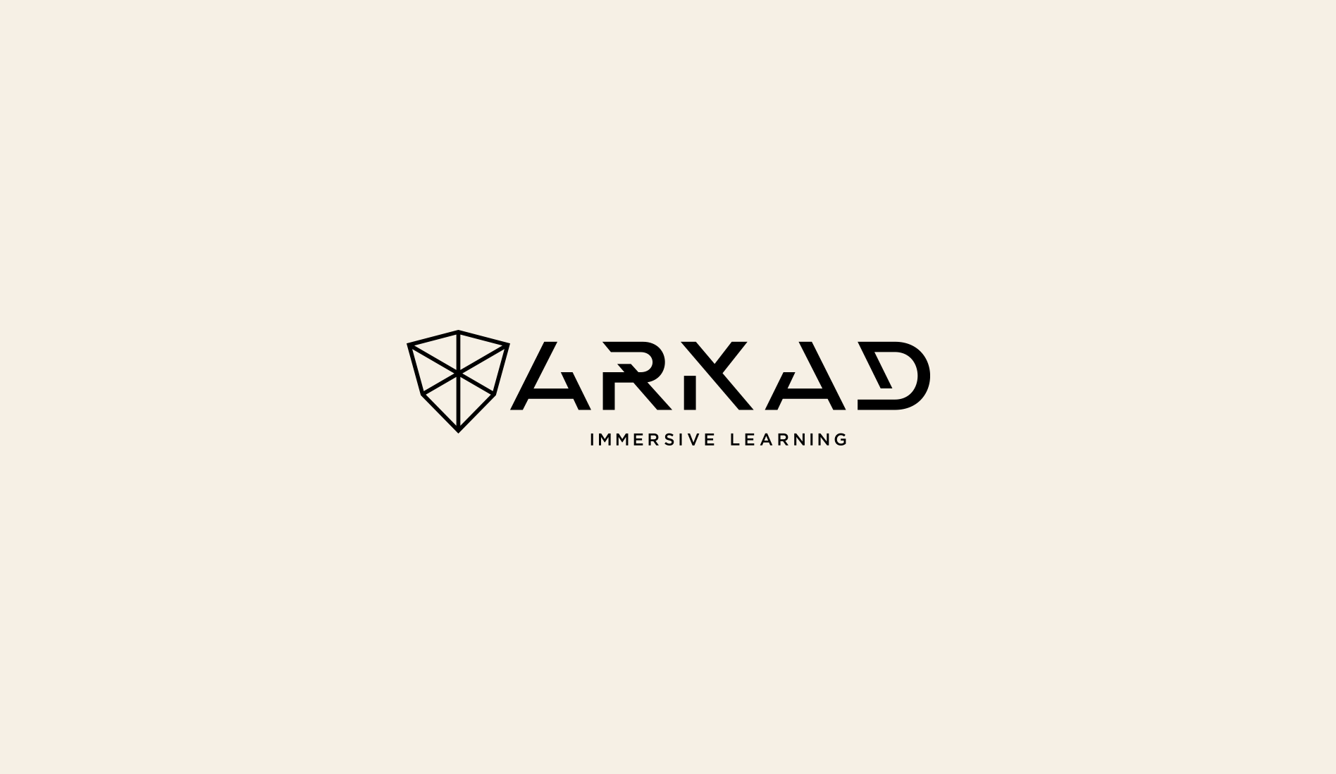
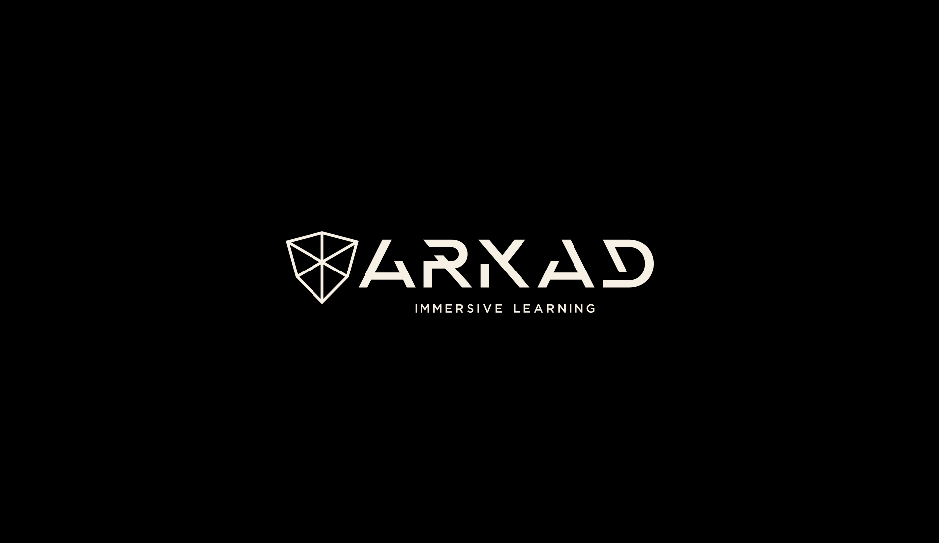
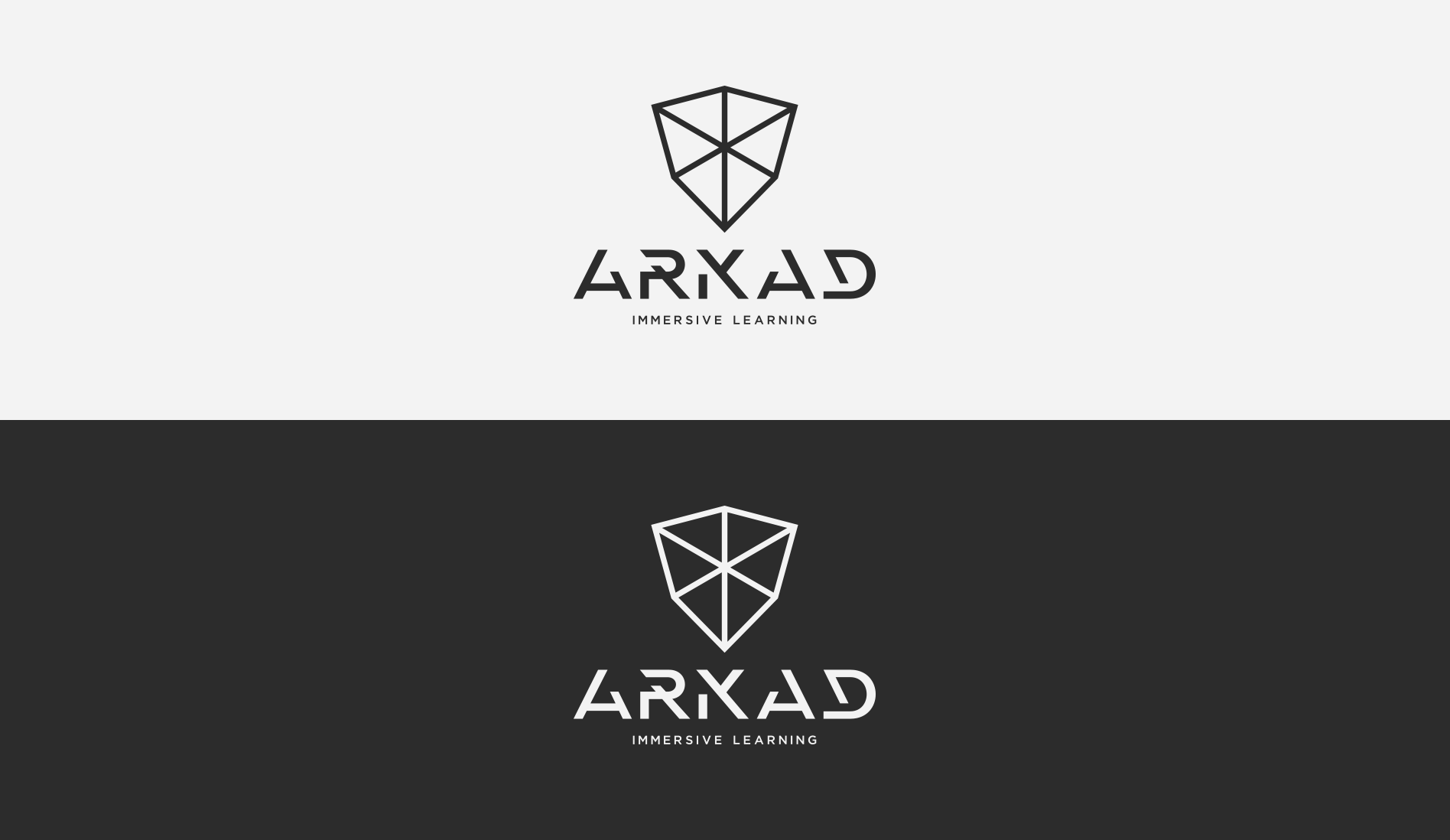
ARKAD
- Category: Logos / Branding / Animation
- Design Focus: Futurism and Organic Contrast
- Inspiration: VR vs Classic Akademia
- Theme: Digital Immersive Learning
- Project date: December, 2023
Immersive Learning Platform
Blending classical knowledge with digital technology, reflectsing the duality of digital immersion and organic knowledge. The ivory and carbon palette evokes the timeless feel of book pages, while the futuristic elements highlight the forward-thinking nature of the platform.
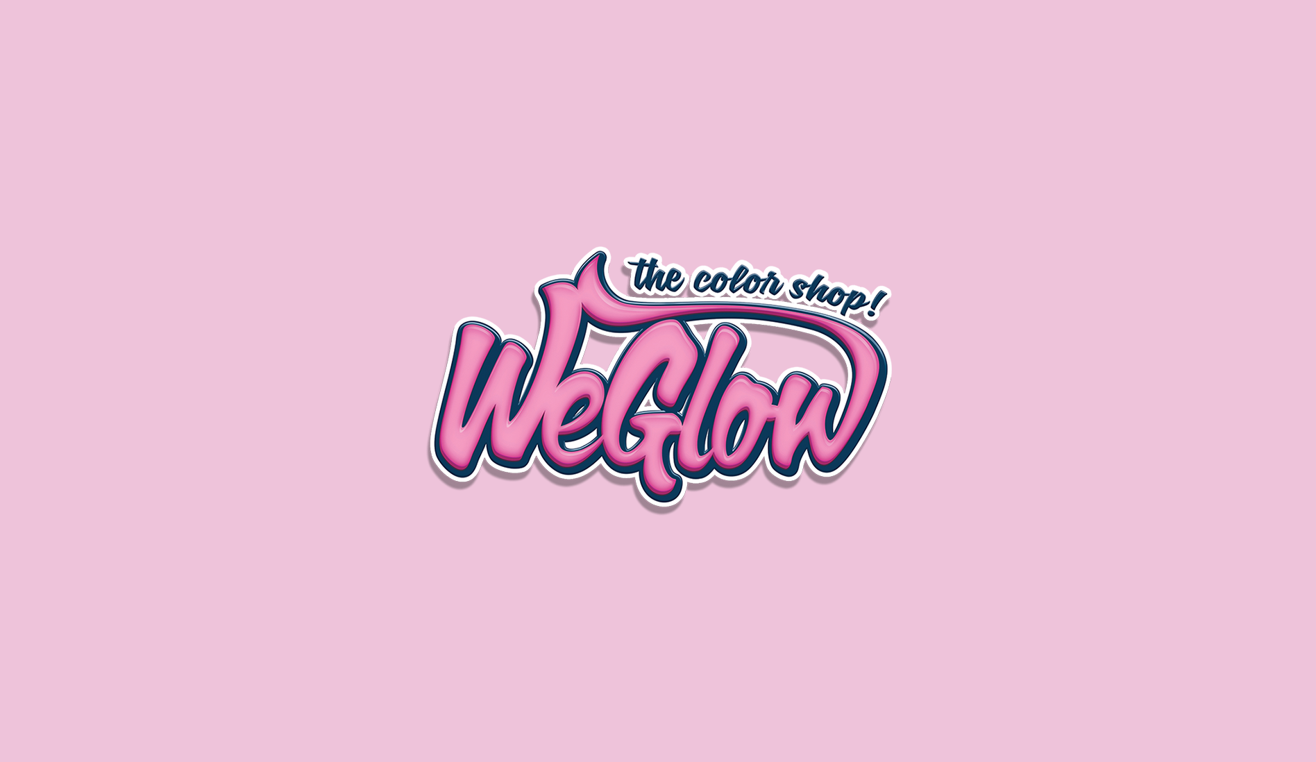
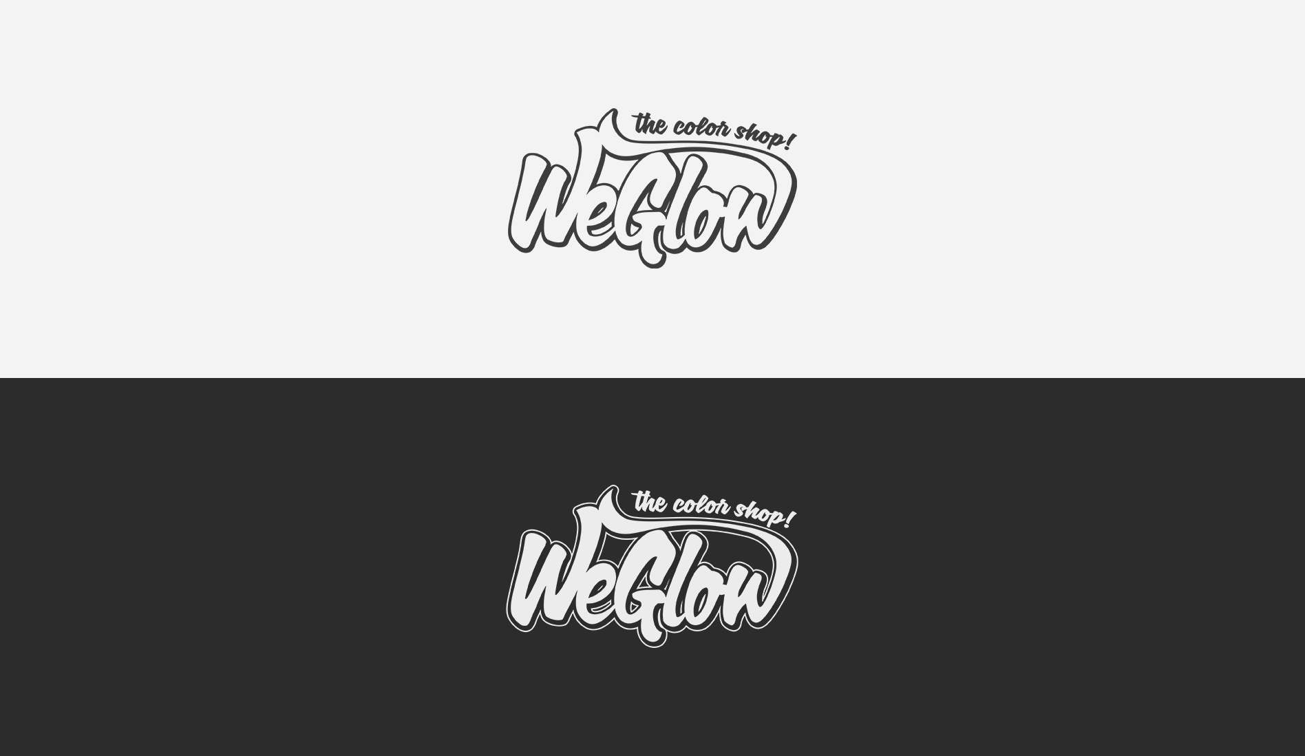
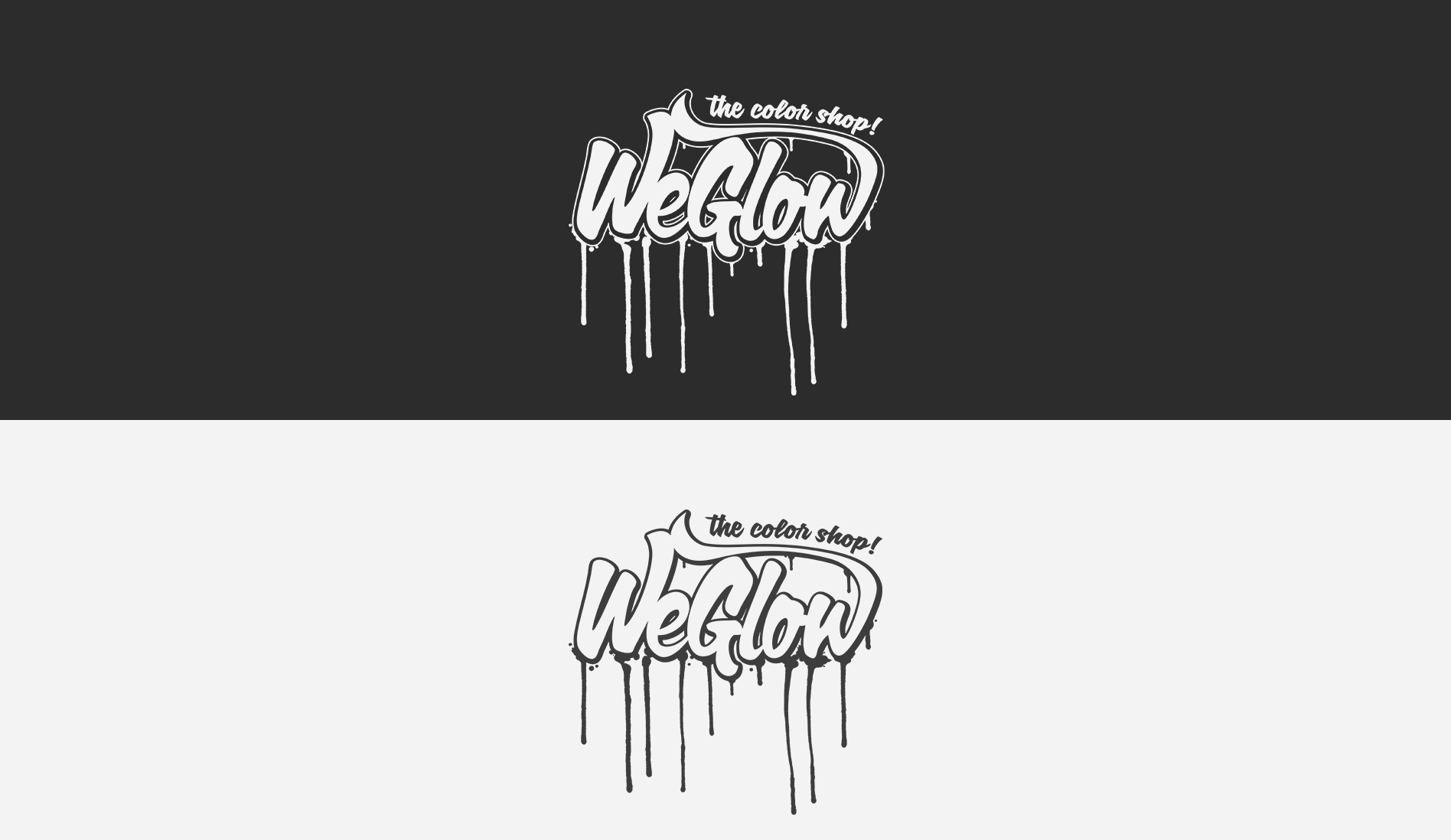
WeGlow - The Color Shop
- Category: Logos / Branding / Merch
- Design Focus: Vibrance and Playfulness
- Inspiration: Neon Candy Aesthetic
- Theme: Fluorescence and Event Energy
- Project date: March, 2016
Online Shop for Event Products
WeGlow is specialized in glow and fluorescent items and this rebranding captures a vibrant, candy-like aesthetic, reflecting the fun and colorful nature of their products, positioning WeGlow as a trendsetter in Portugal's party scene.
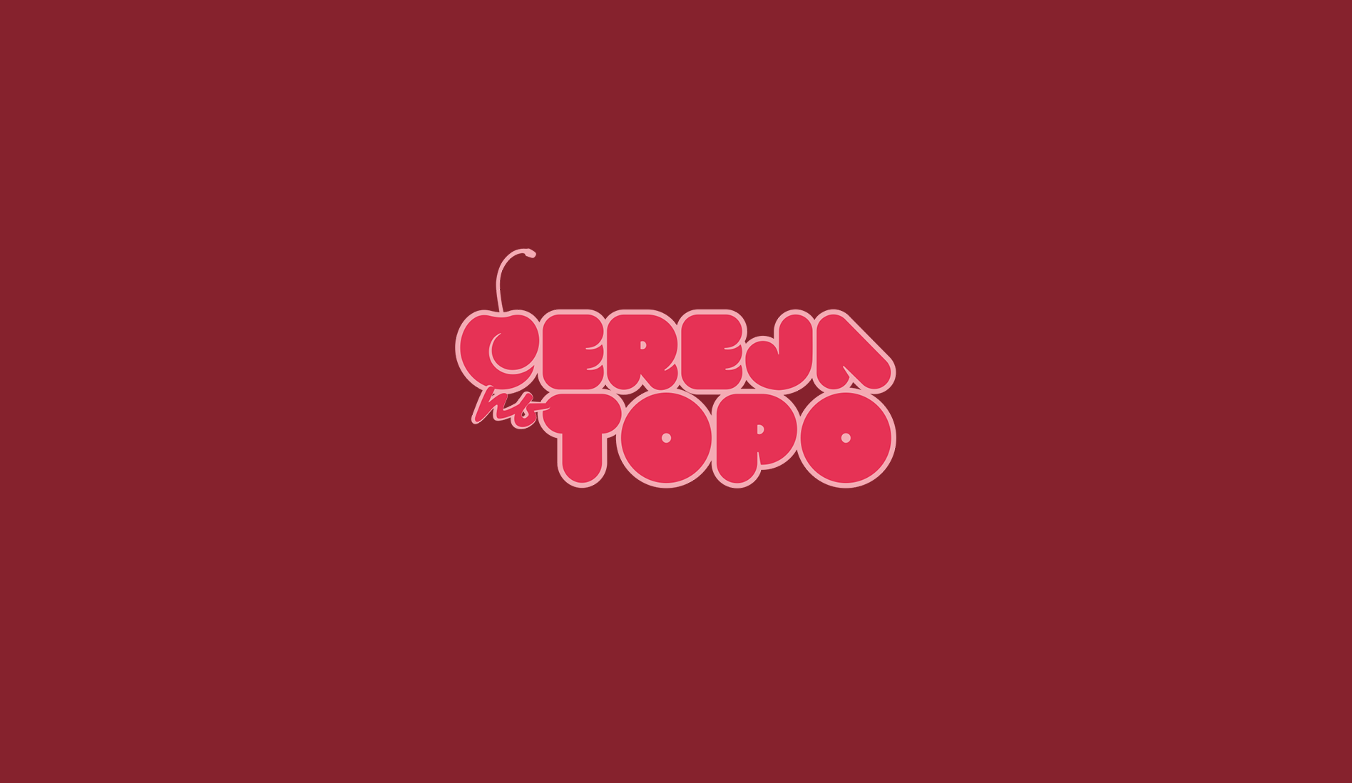
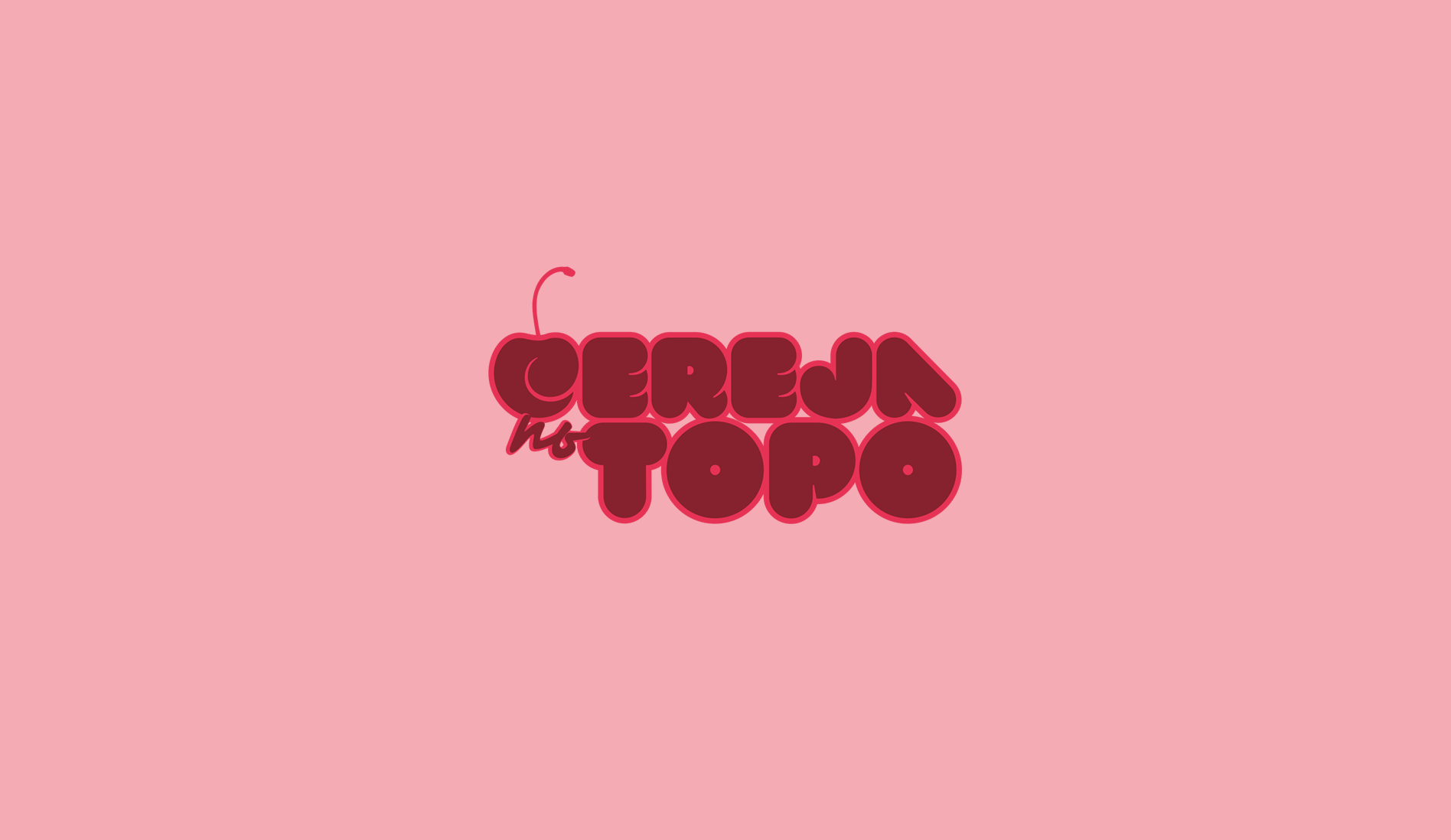
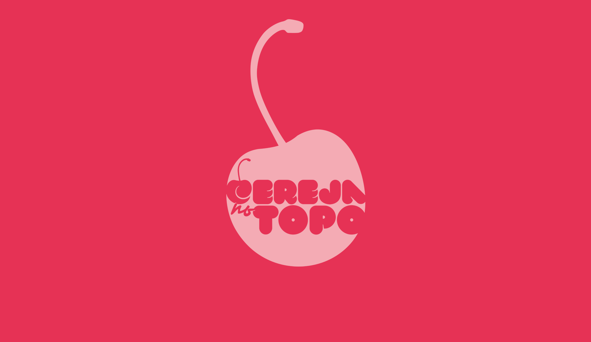
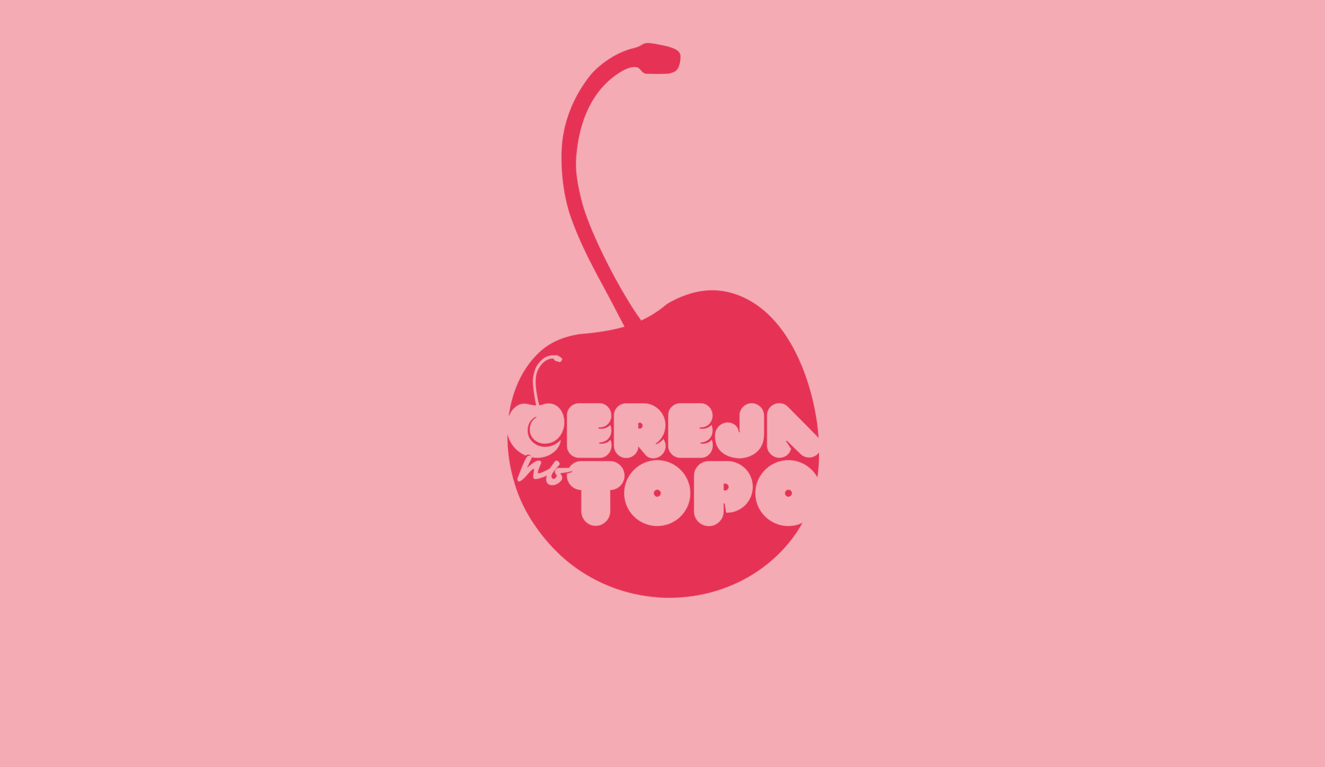
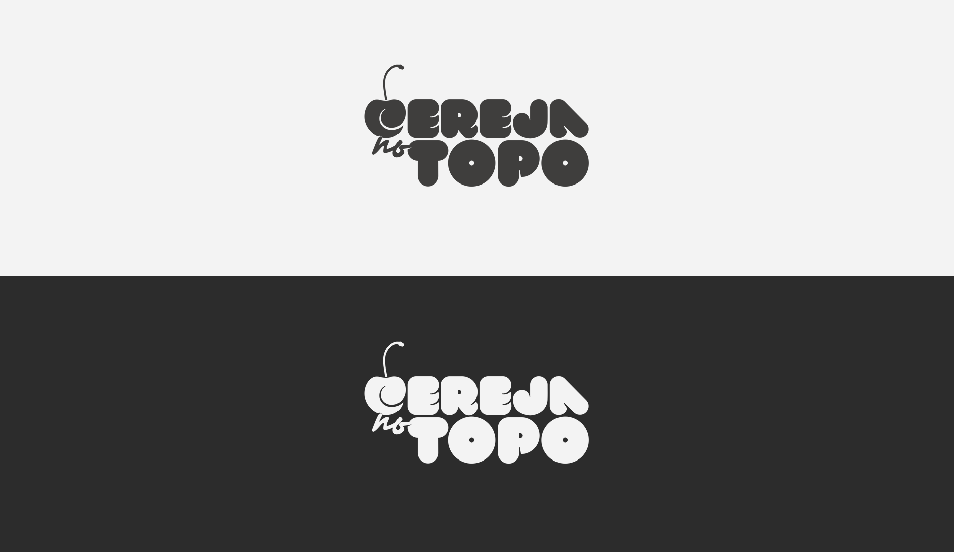
Cereja no Topo
- Category: Logos / Branding
- Design Focus: Whimsy and Sweetness
- Inspiration: The "cherry on top" metaphor
- Theme: Completeness and Visual Appeal
- Project date: January, 2021
Pastry & Cake Design Business
In this project, I tried to capture the idea of adding the perfect finishing touch. The round fonts, cherry silhouette, and bright colors, like the cherry red and pink blossom, convey charm and sweetness, embodying the joy of baking and the concept of completeness.
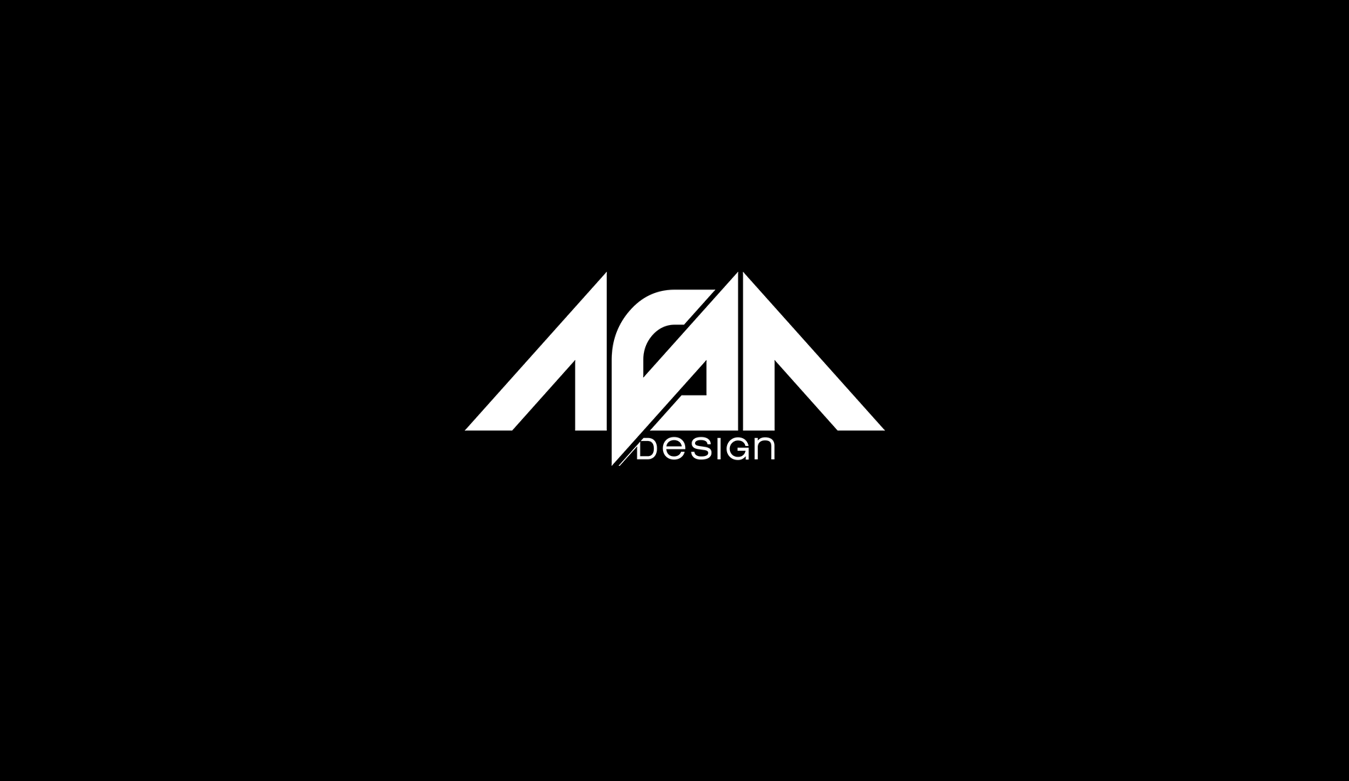
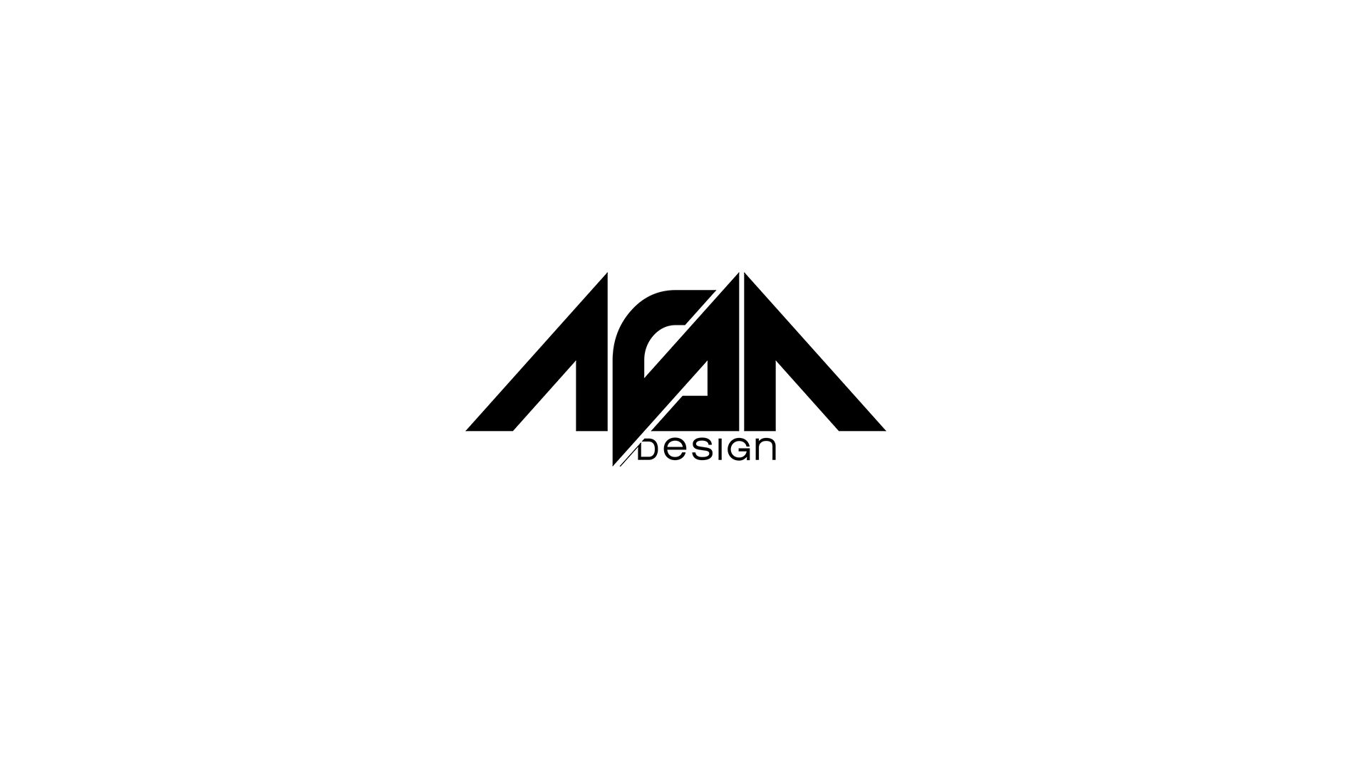
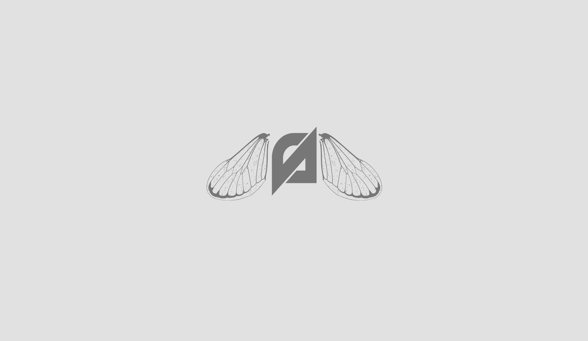
ASA design
- Category: Logos / Branding
- Design Focus: Simplicity and Conceptual
- Inspiration: "Give wings to imagination"
- Theme: Wings and Creativity
- Project date: June, 2016
Graphic Design Studio
The triangular shapes represent wings, inspired by a PT expression, "give wings to imagination", symbolizing creativity and freedom. With a monochrome palette, the logo carries versatility and elegance. An alternate version features insect wings, adding an imaginative twist to the brand.
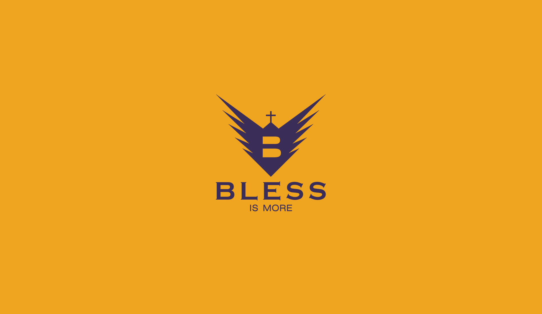
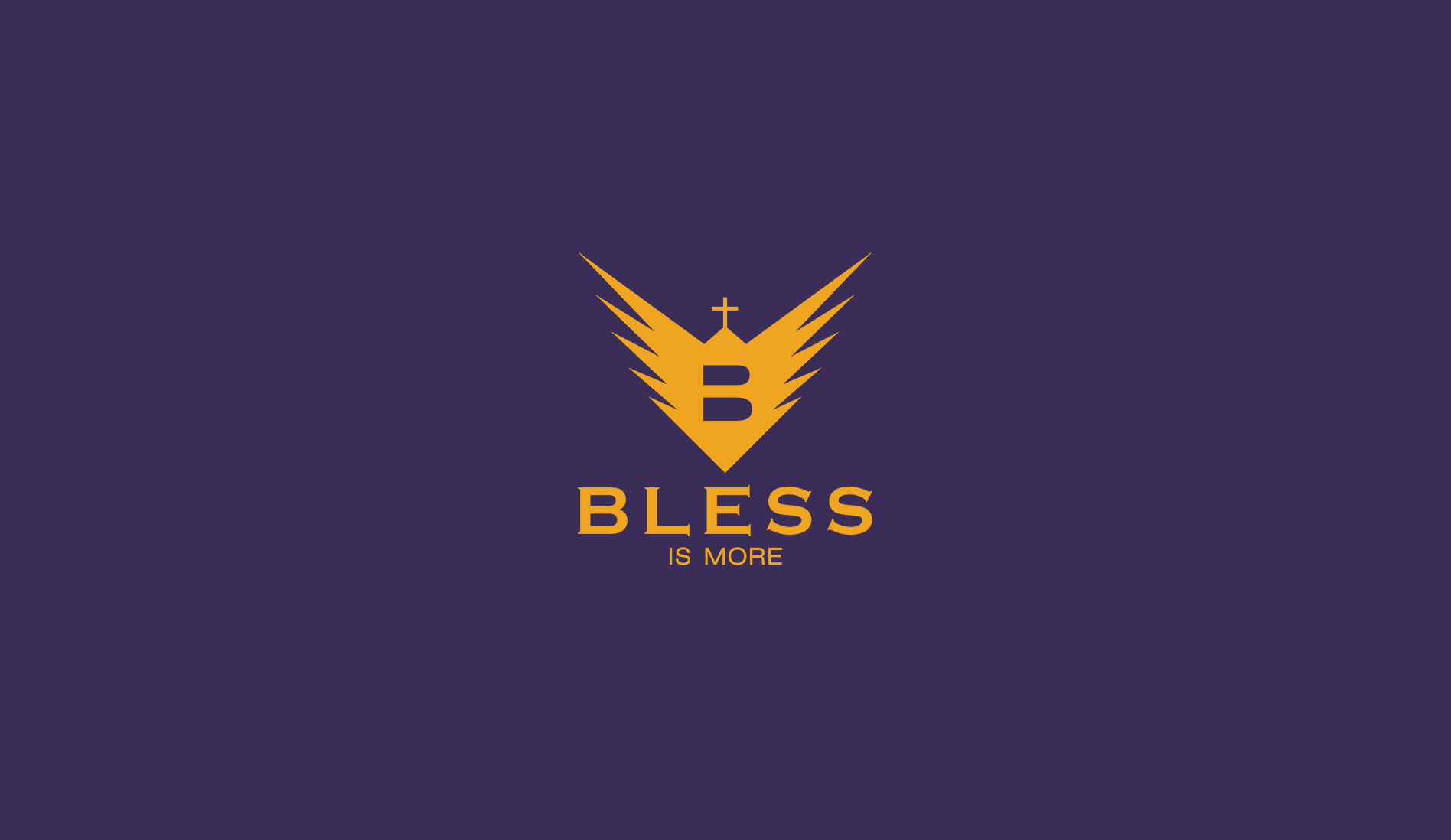
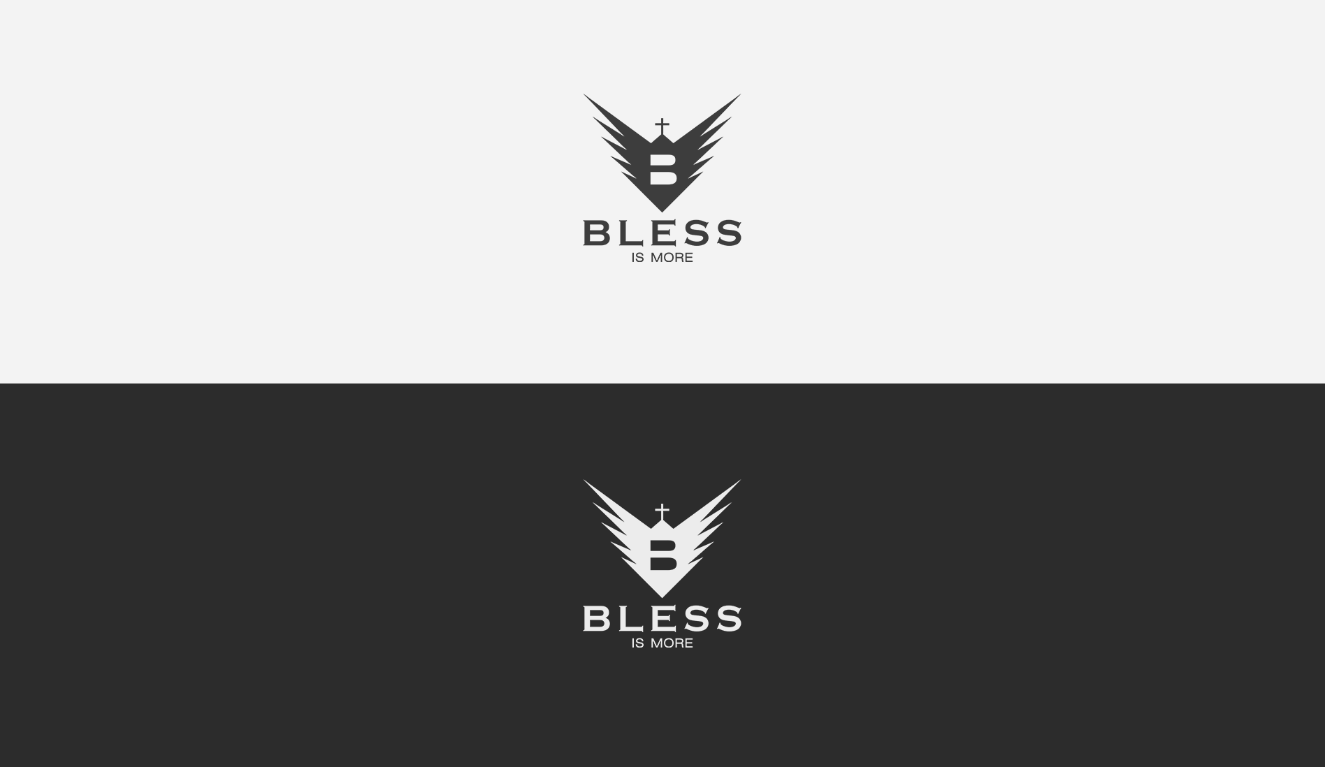
BLESS
- Category: Logos / Branding
- Design Focus: Faith and Symbolism
- Inspiration: Faith, Angelic Wings, Blessings
- Theme: Spirituality and Royalty
- Project date: April, 2018
Beach Store Brand
With a strong Christian identity, this logo incorporates angelic wings also resembling a downwards arrow, symbolizing blessings descending from above. The cross unifies faith and branding seamlessly. The gold and purple palette express a sense of royalty, reflecting the belief in a divine heritage.
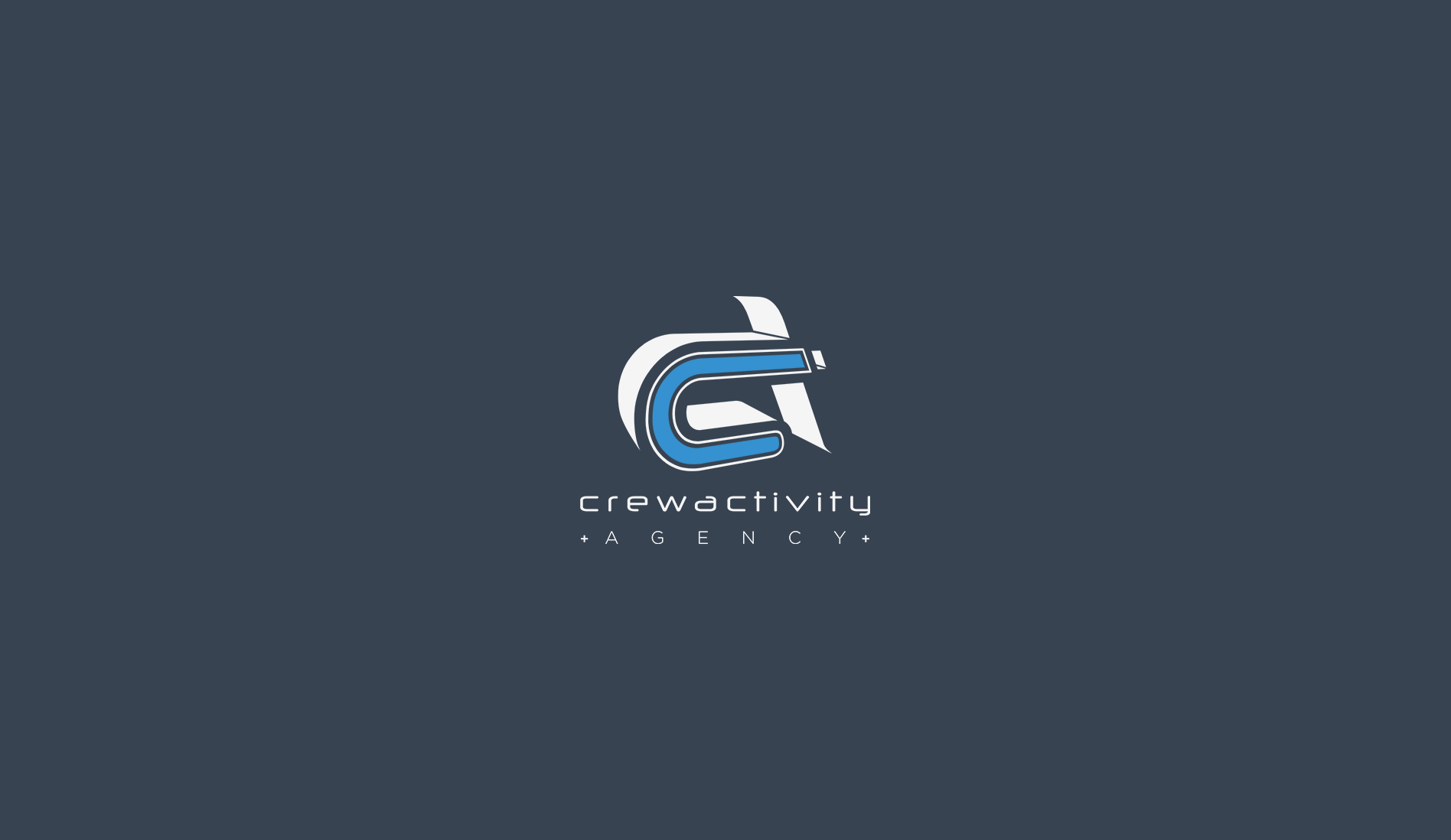
Crewactivity
- Category: Logos / Branding
- Design Focus: Teamwork and Dynamism
- Inspiration: 3D shadows, Imagination
- Theme: Connectivity and Creativity
- Project date: May, 2010
Design & Communication Agency
Imagined and crafted to highlight concepts of teamwork dynamics. The three-dimensional interplay between the letters C & A connect "Crew" with "Activity". The black and white paired with electric blue conveys creativity, inspiration, and sensitivity, adding vibrancy to the agency's energetic essence.
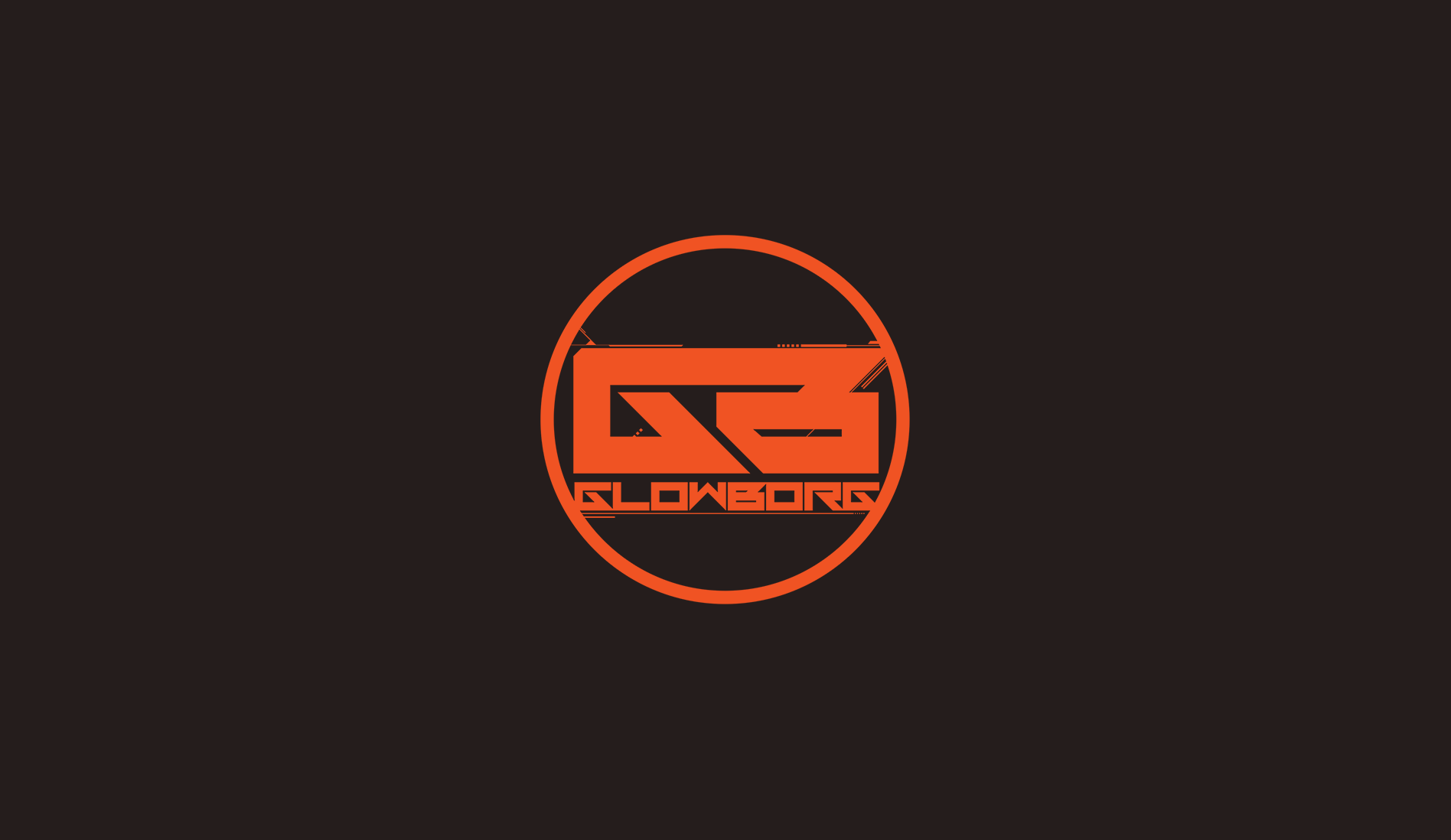
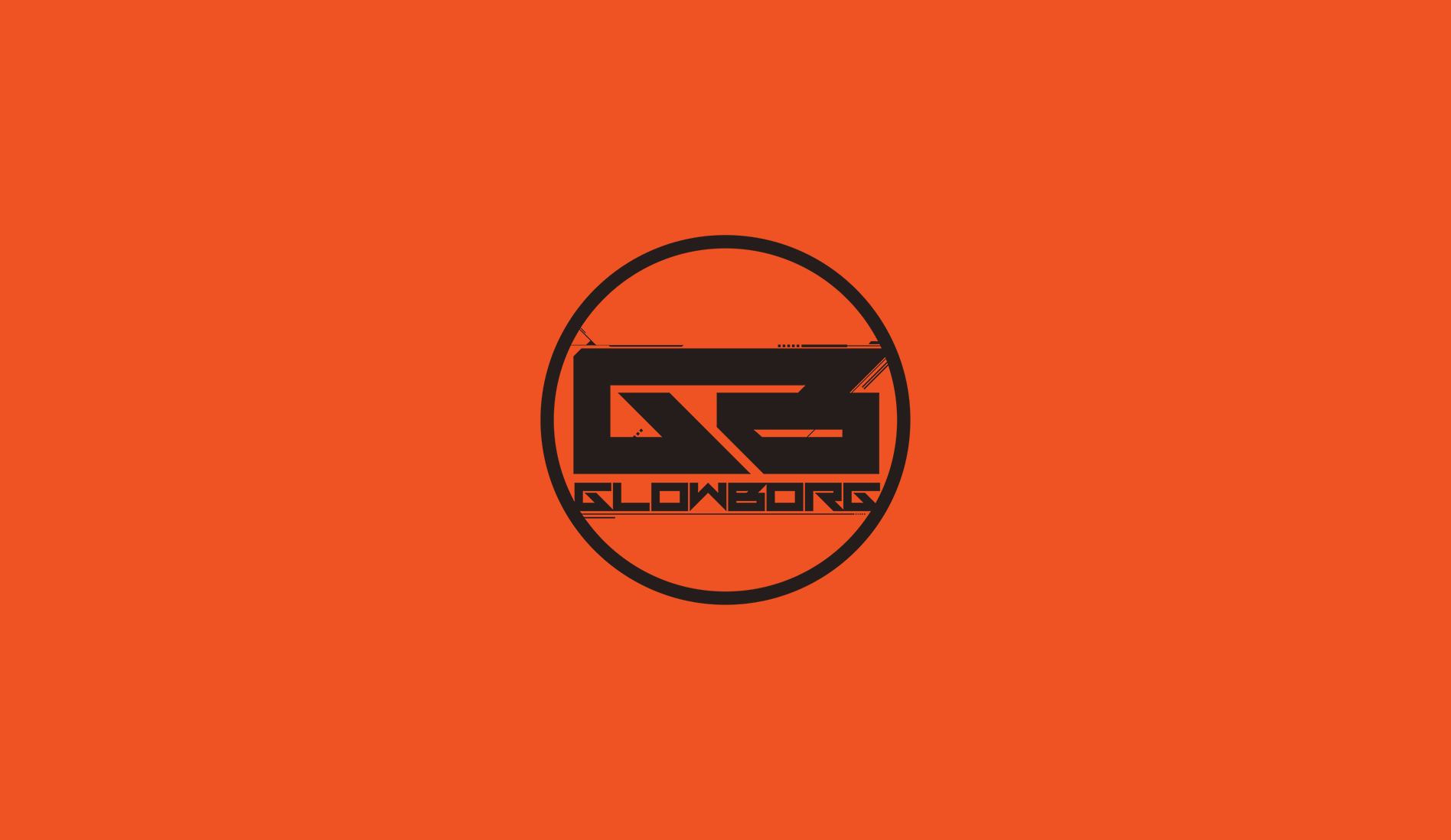
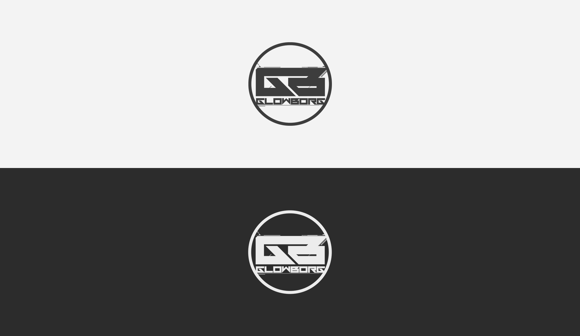
GlowBorg
- Category: Logos / Branding
- Design Focus: Futurism and Bold Recognition
- Inspiration: LED Aesthetics and Circuitry
- Theme: Technology and Performance Energy
- Project date: January, 2014
Event Performer (giant LED robot)
Designed for a performer with an eye-catching 2.5m LED suit, the futuristic initials 'G+B' are integrated with circuit details to emphasize the tech element. The vibrant orange against a subtle black projects a distinct energy, making the logo a bold and recognizable mark on stage.
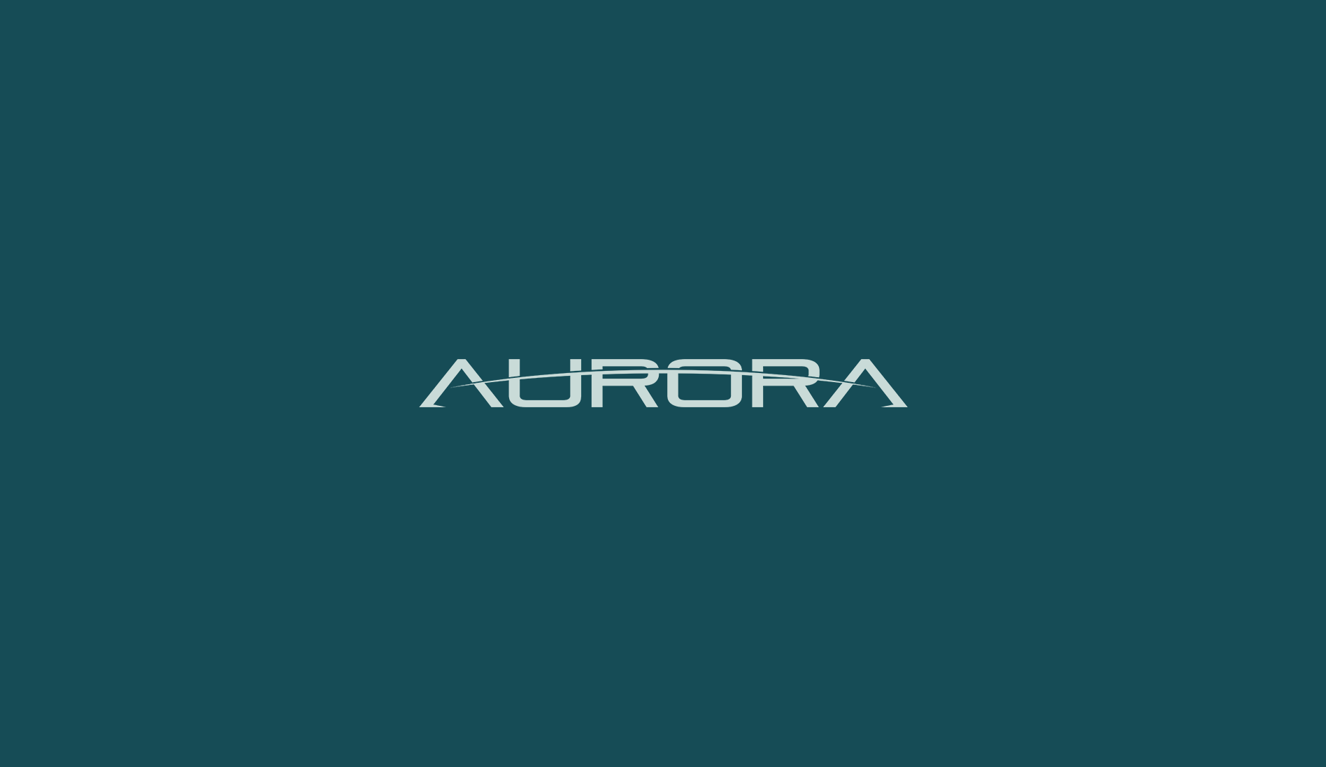
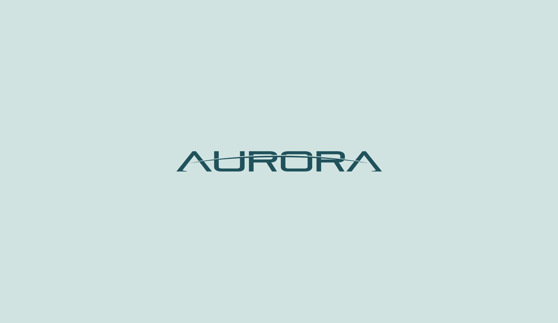
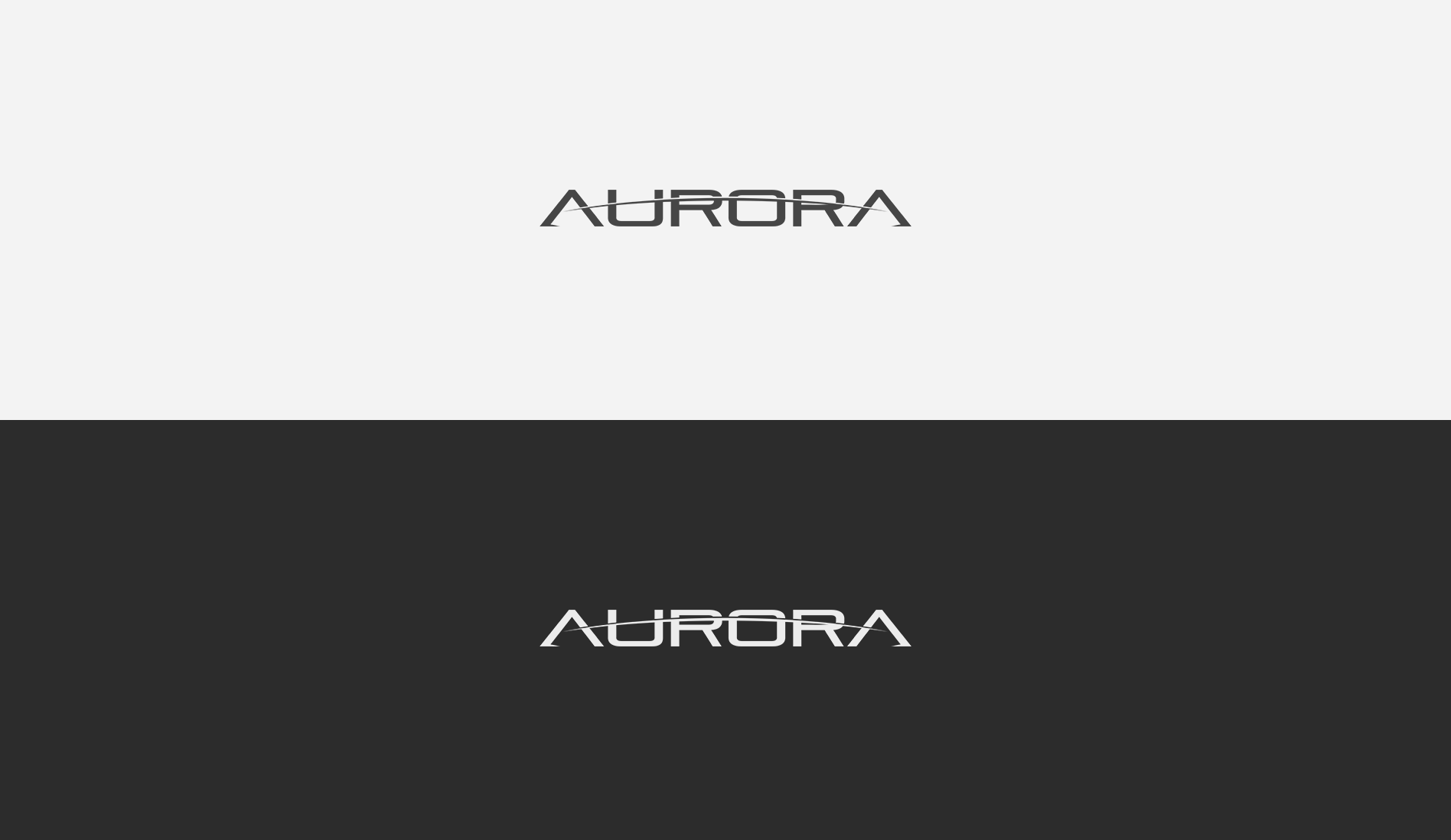
Aurora
- Category: Logos / Branding
- Design Focus: Future and Social Awareness
- Inspiration: J. Fresco's Proj. Venus - RBE
- Theme: Earth’s Curvature and Sustainability
- Project date: December, 2011
Social Awareness Documentary
Inspired by the aurora borealis, this logo uses aqua tones to evoke natural beauty. The modern typeface reflects the project's forward-thinking goals in reshaping society. The crossing arc symbolizes earth's curvature at sunrise, representing a new beginning and hope for a balanced future.
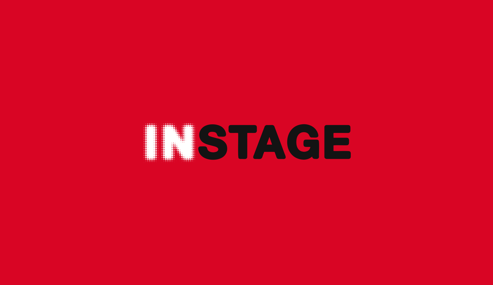
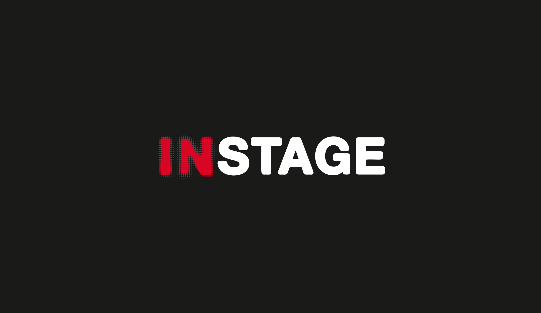
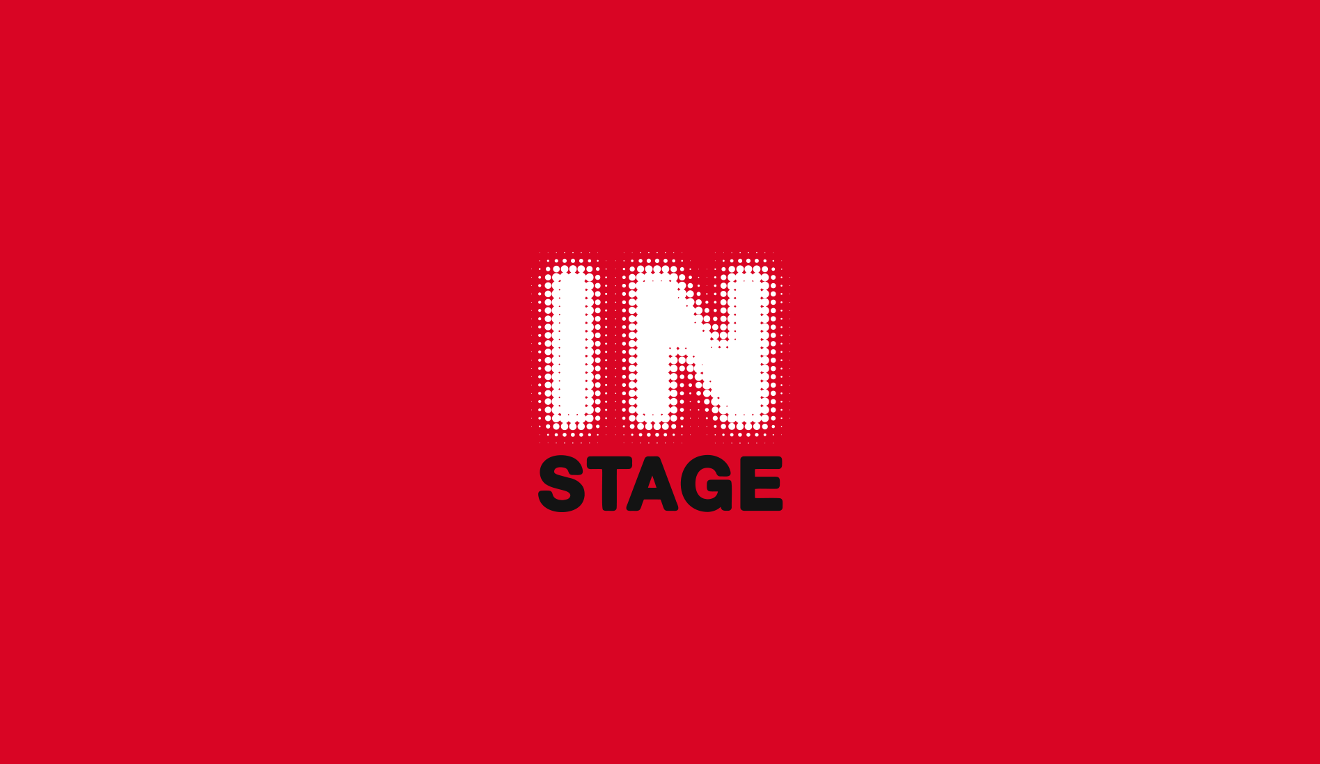
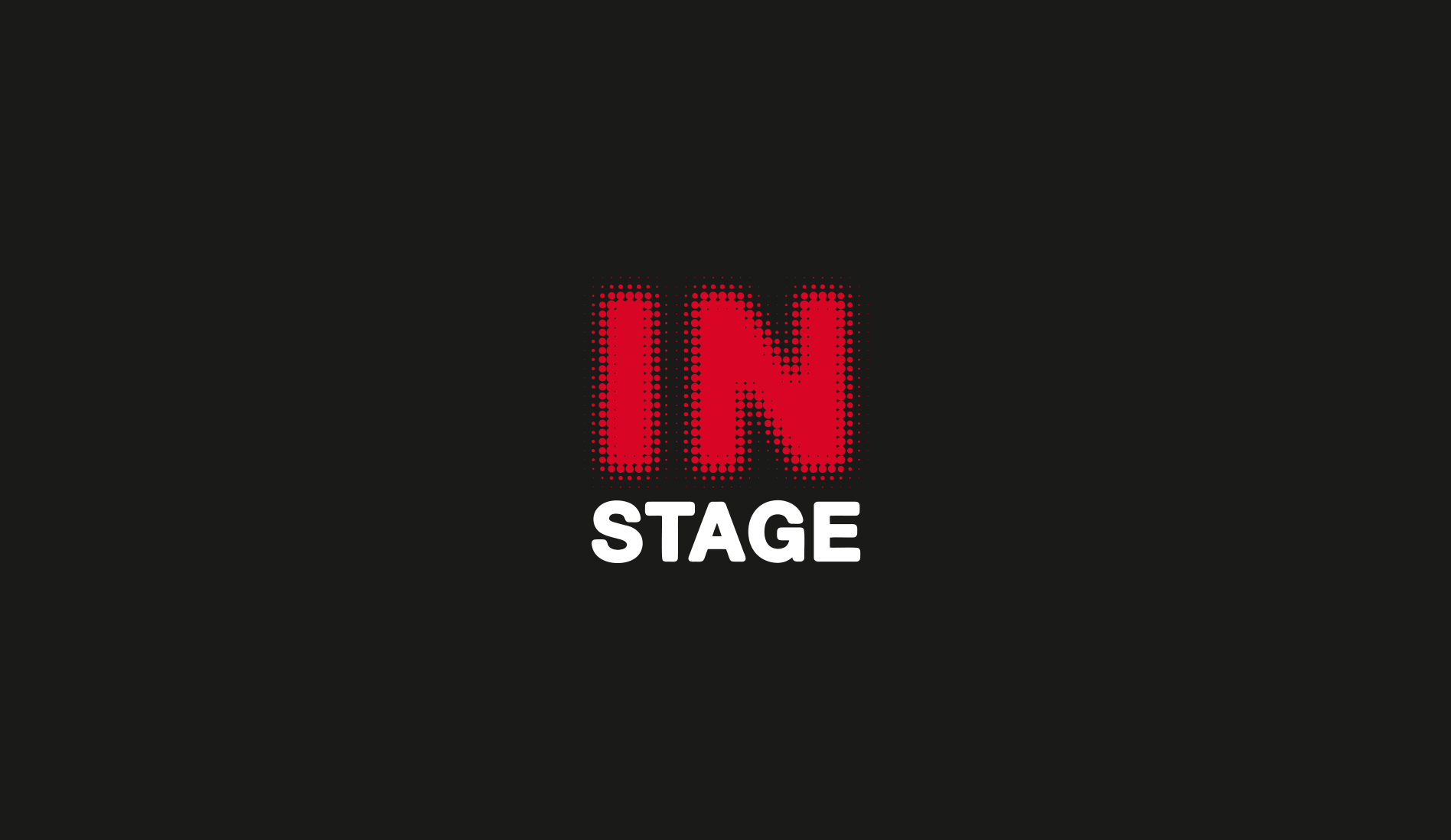
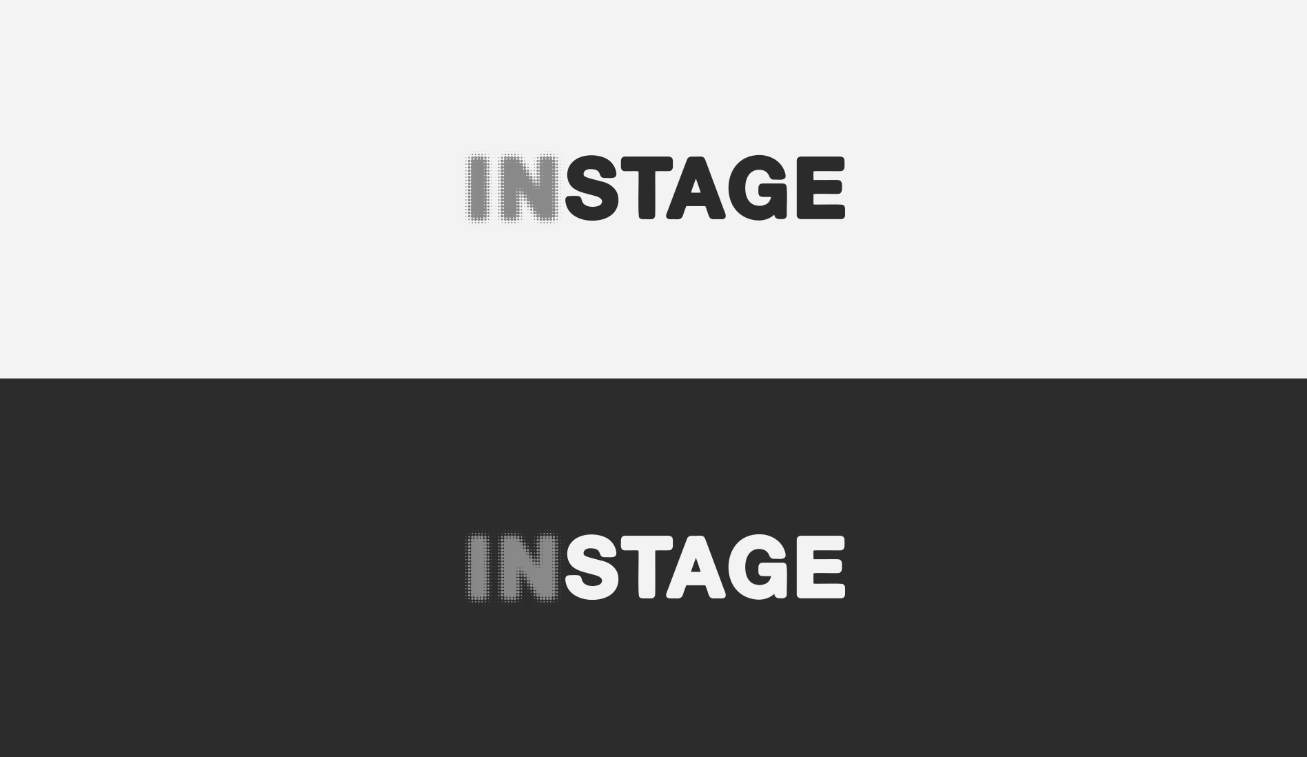
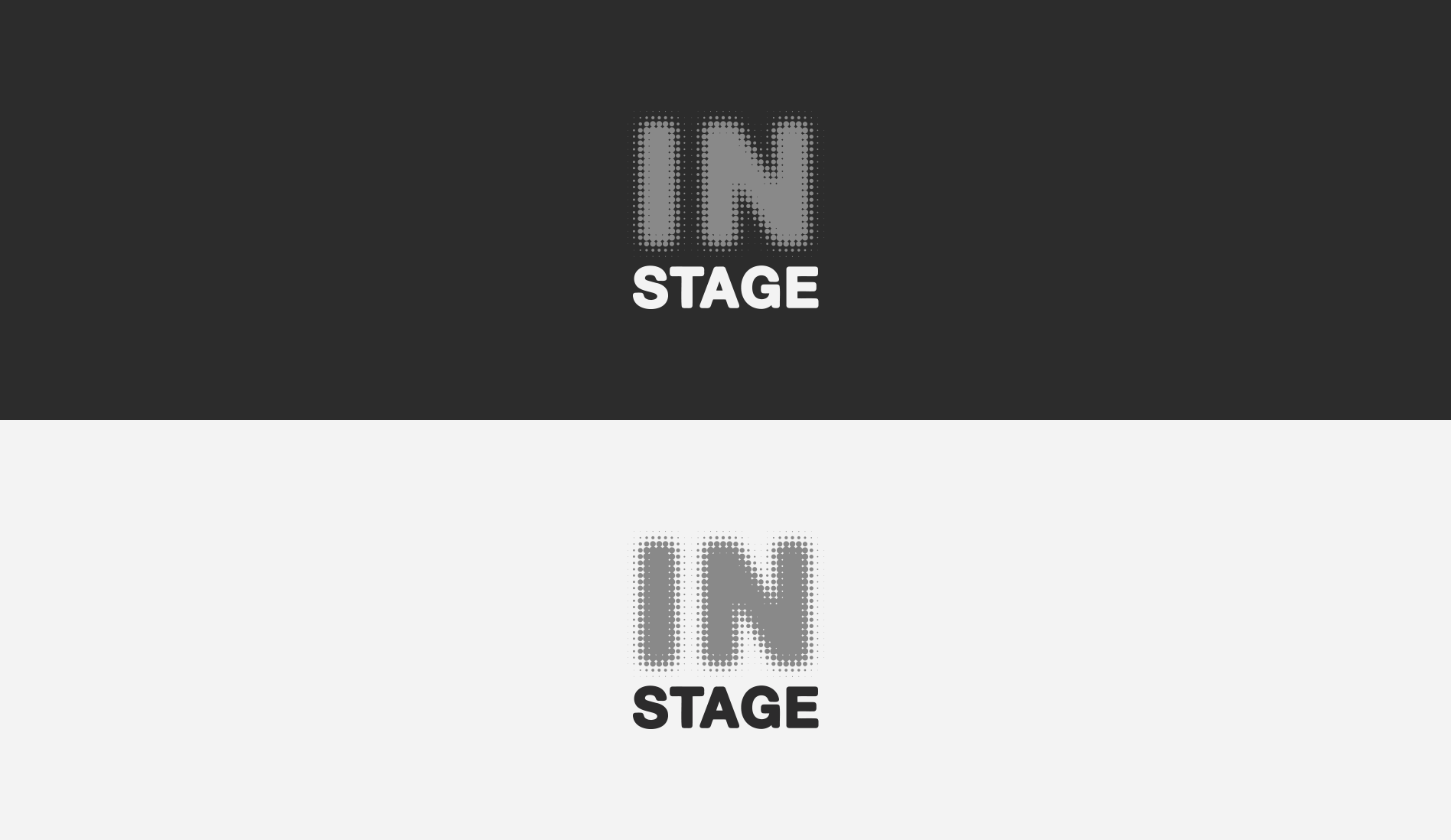
InStage
- Category: Logos / Branding
- Design Focus: Simplicity and Bold Recognition
- Inspiration: Stage Lighting and Halftones
- Theme: Stage Performance and Special FX
- Project date: April, 2017
Special Effects for Stages and Studios
Inspired by stage lights and their halftone blur effect, representing the idea of being "in stage." The bold red, black, and white color choice provides high contrast and recognition. A clean typeface ensures the halftone effect stands out without losing legibility, making the logo modern and impactful.
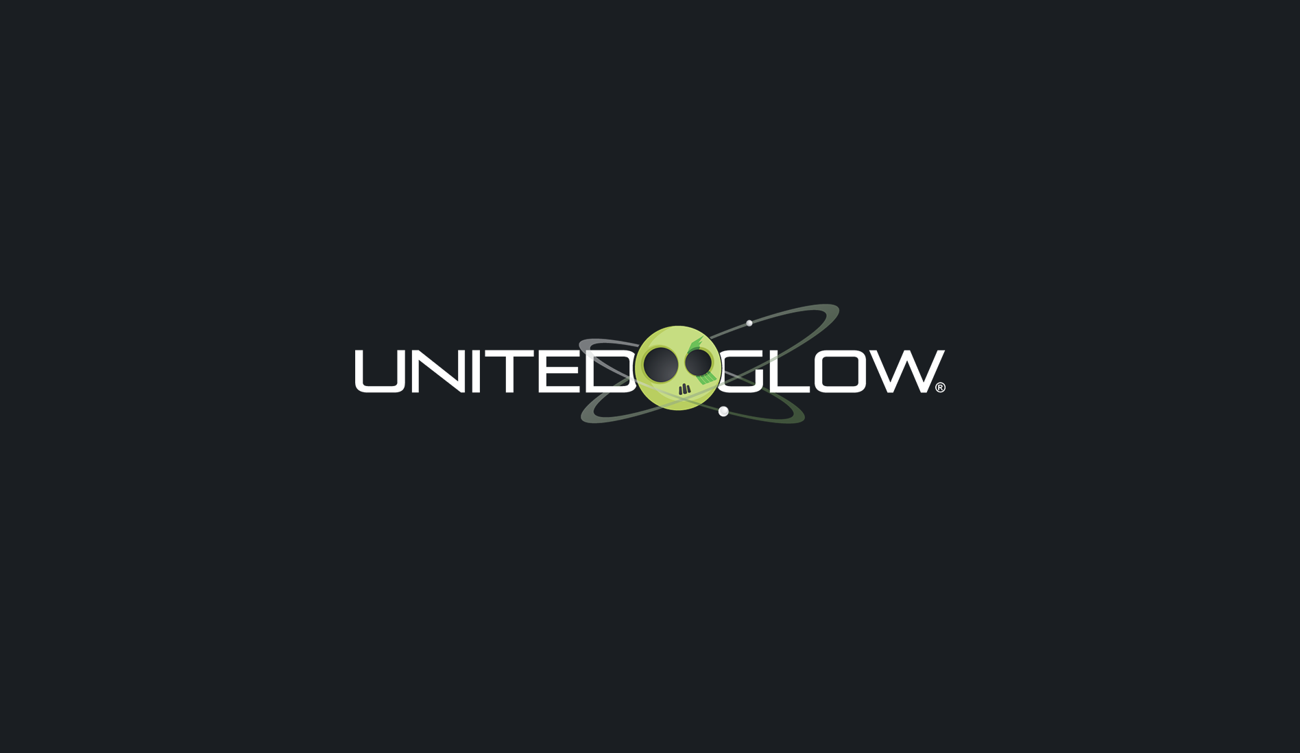
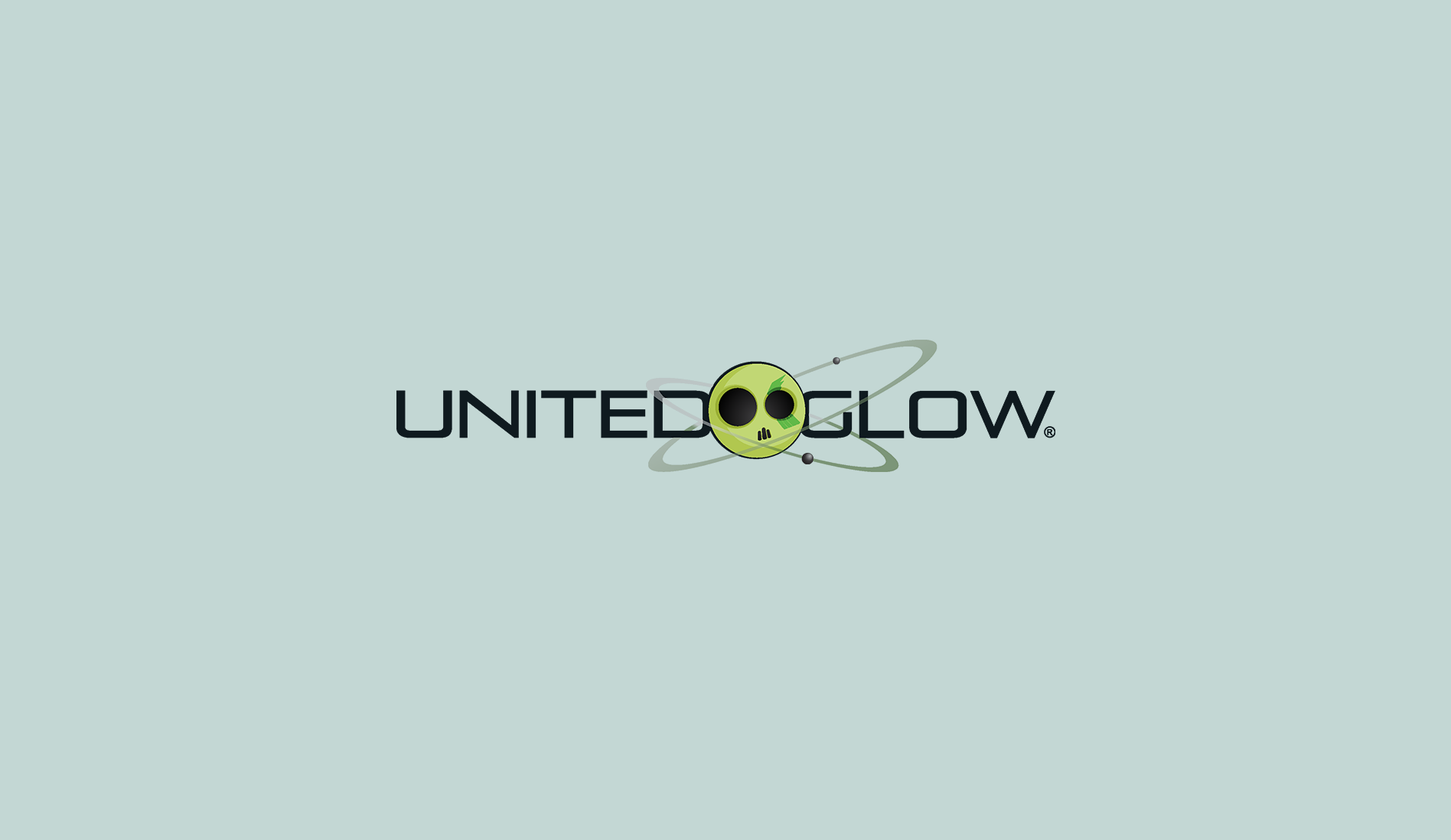
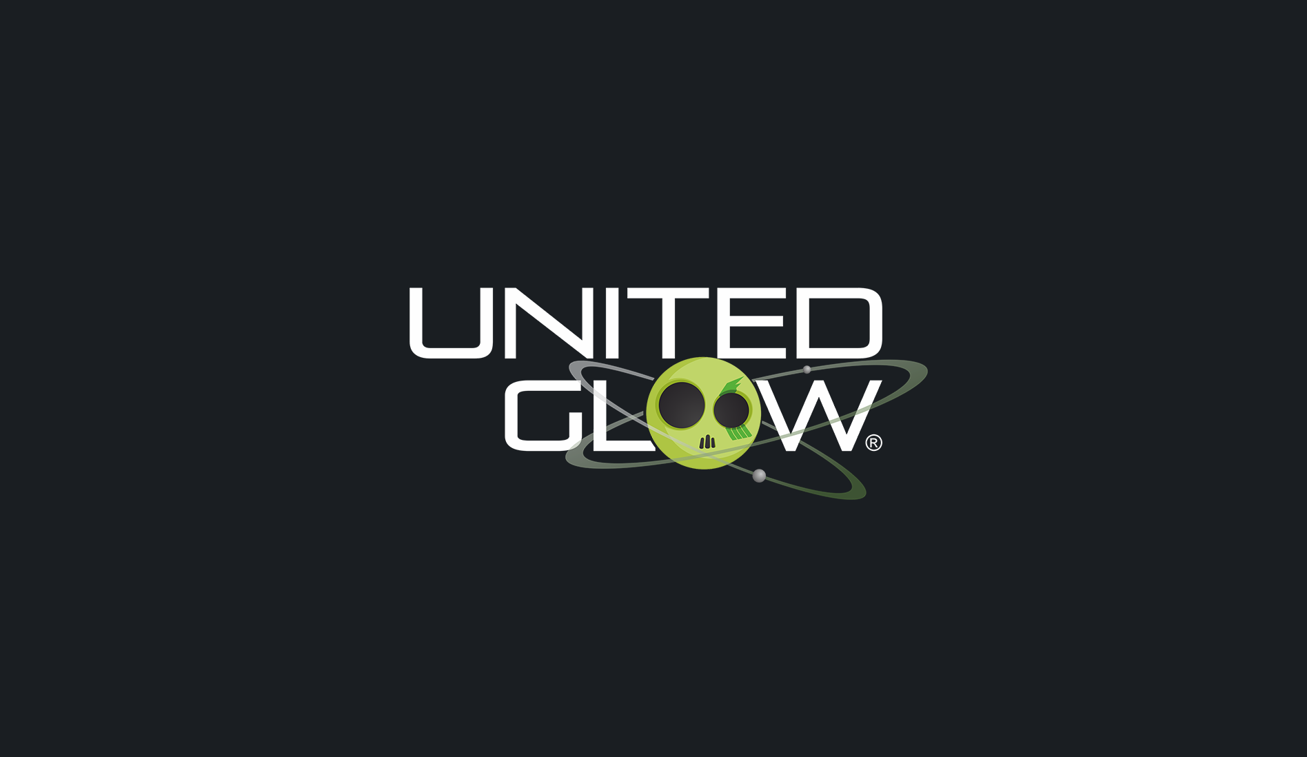
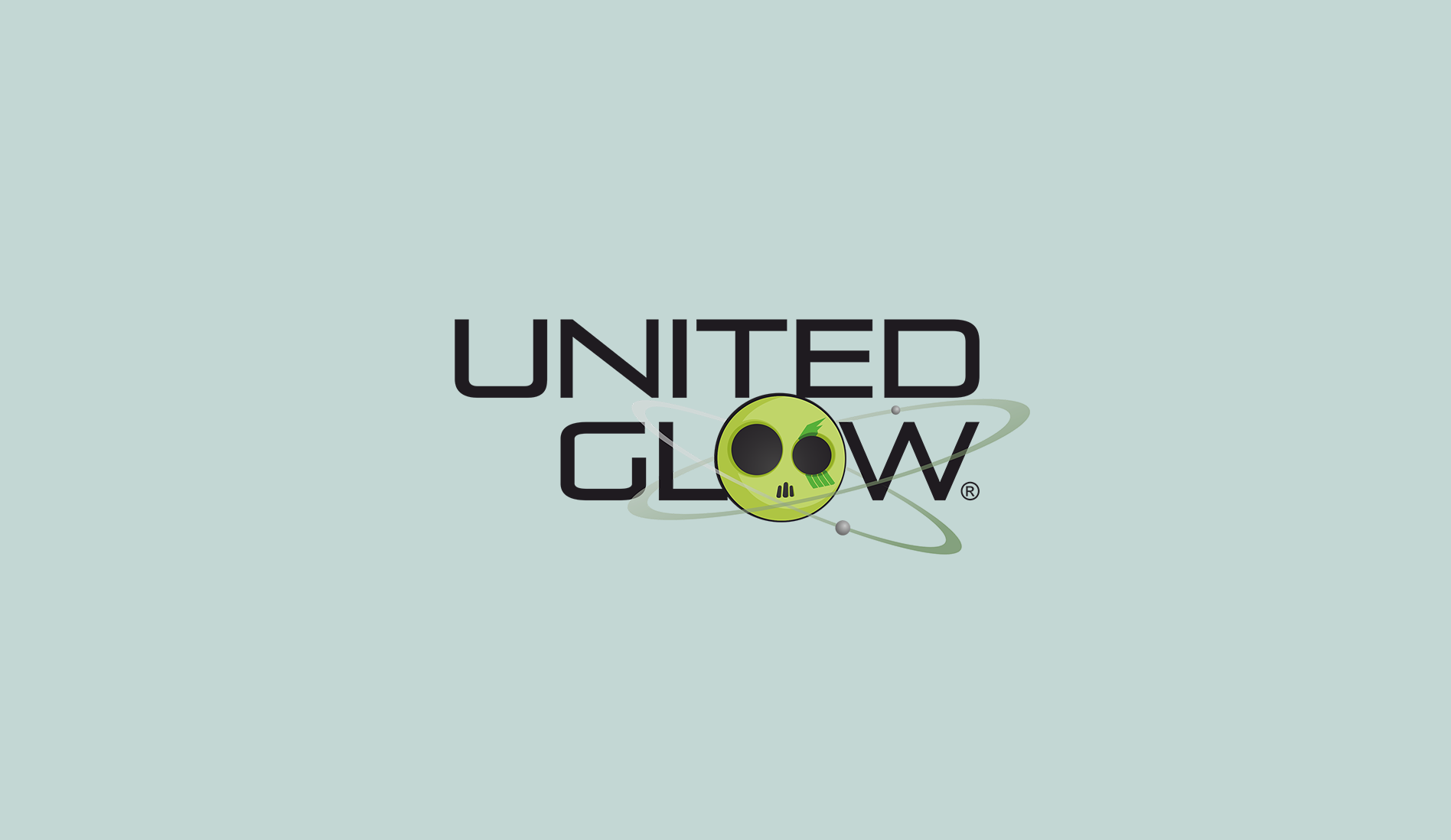
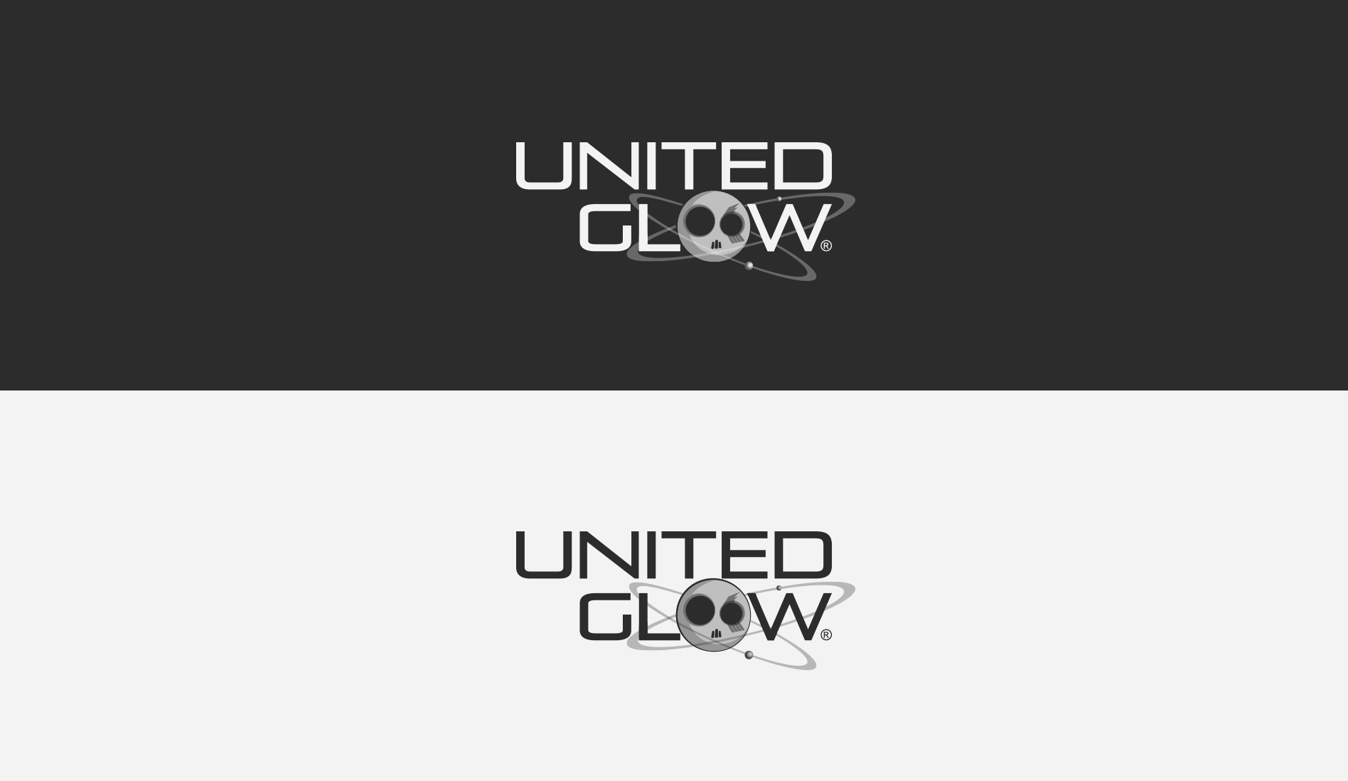
United Glow
- Category: Logos / Branding
- Design Focus: Movement and Fluorescence
- Inspiration: Speedminton and Neon Paints
- Theme: Night Sports and Fluorescence
- Project date: May, 2012
Glow Products and Night Sports
United Glow's logo captures the essence of night sports like UV Speedminton. The icon represents both a painted face and the feather tip, framed by ellipses that symbolize speed. The glowing colors contrast sharply against the dark background, highlighting the vibrant energy of night matches.
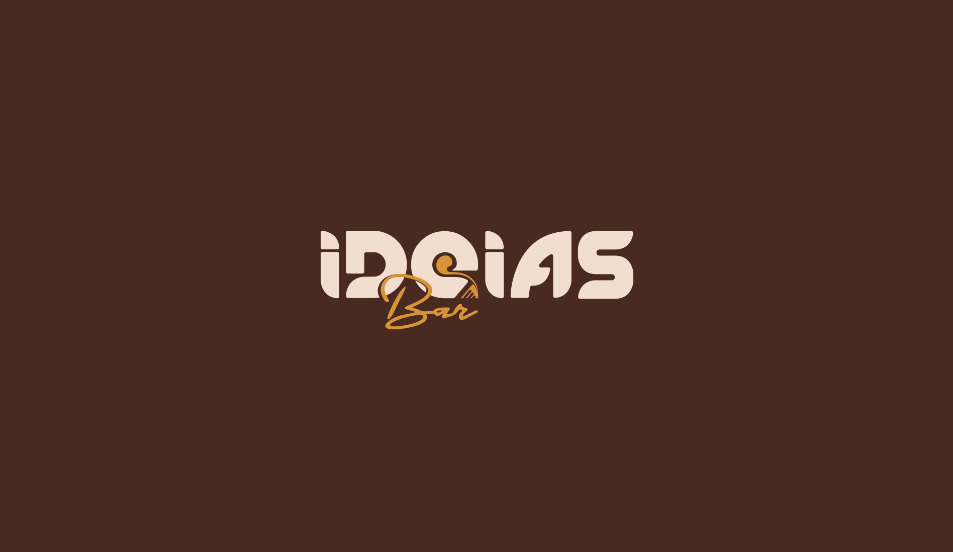
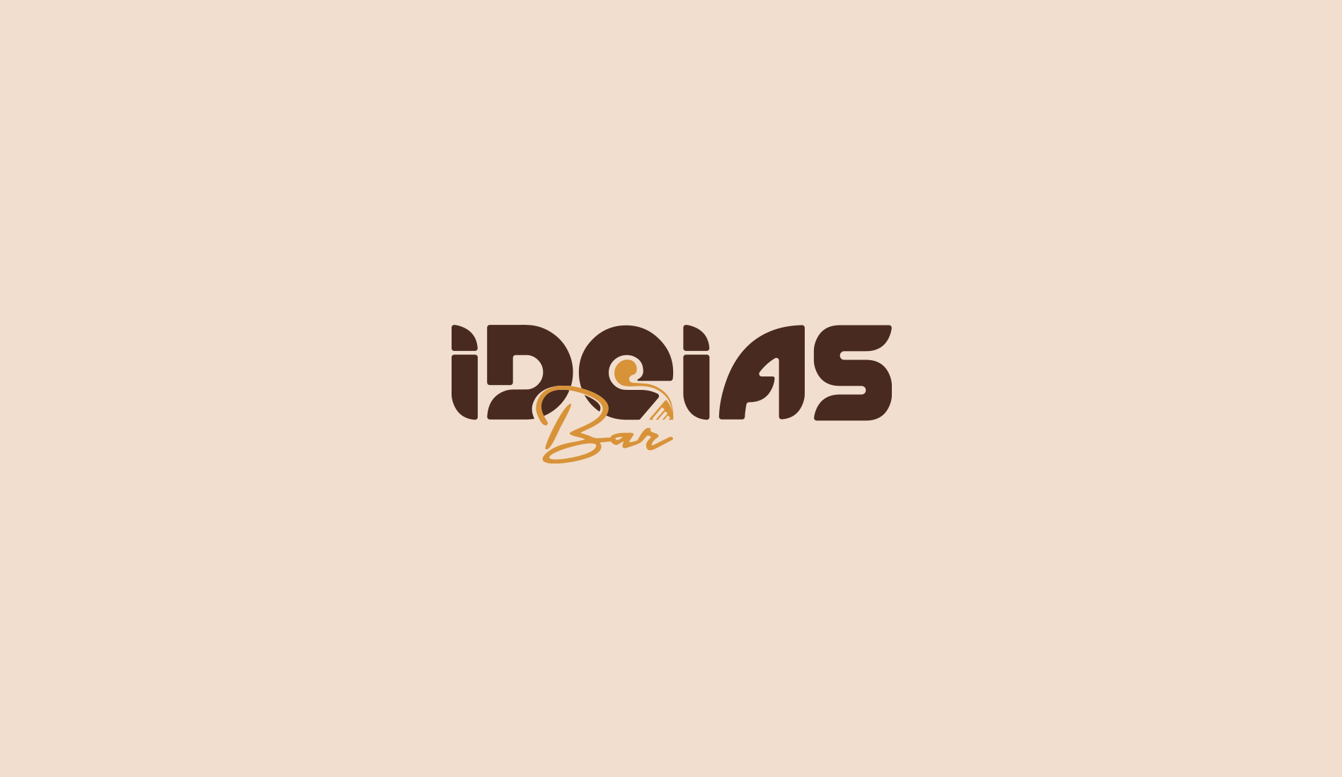
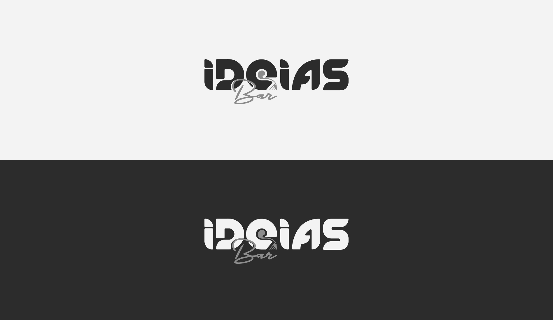
Ideias Bar
- Category: Logos / Branding
- Design Focus: Playful and Youthful Energy
- Inspiration: Coffee Culture and Creative Spark
- Theme: Warmth and Social Interaction
- Project date: January, 2012
Bistrô and Coffee Shop
Infusing a blend of coffee culture by using a color palette brought from classic coffee imagery, creating a cozy and inviting vibe. A groovy typeface suits the young visitors, while the "E" subtly turns into a coffee cup and a light bulb, as a symbol of warmth and creative moments shared over drinks and games.
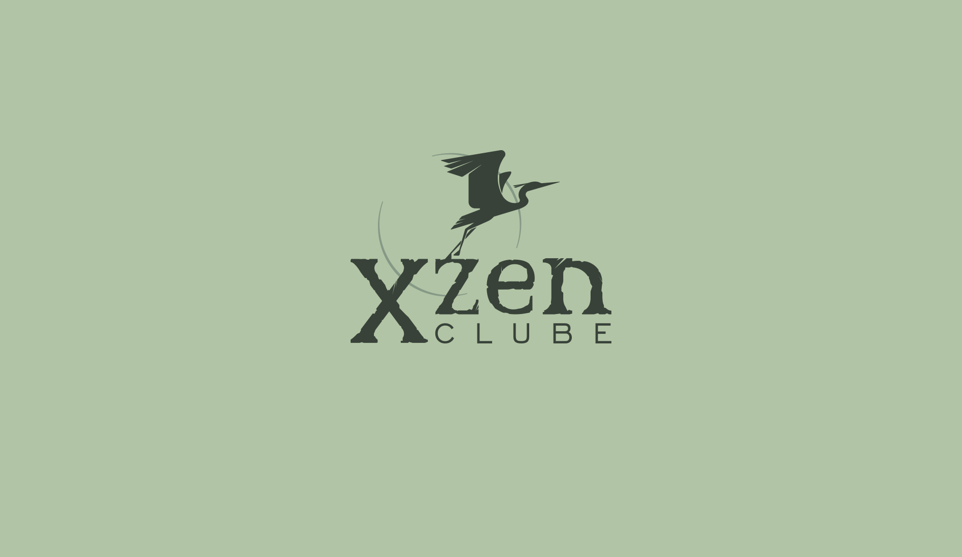
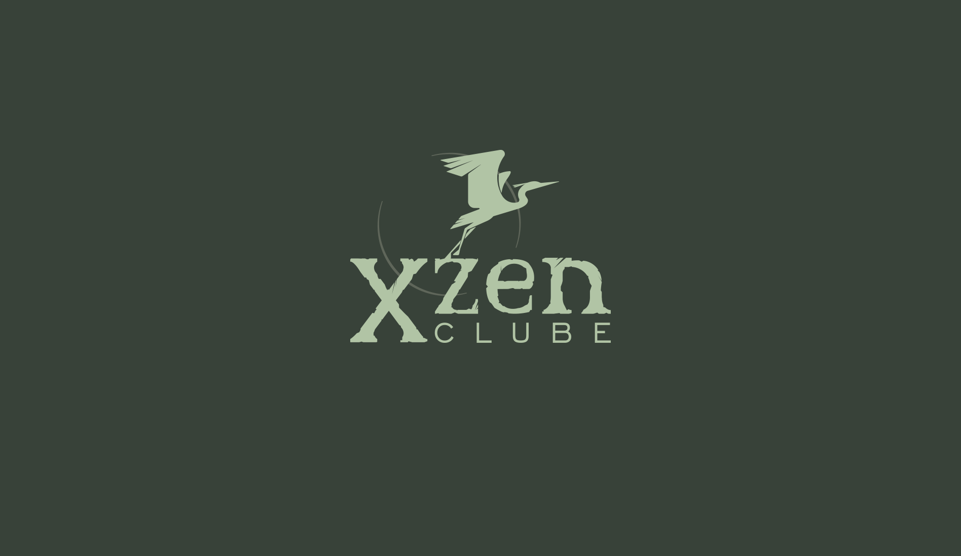
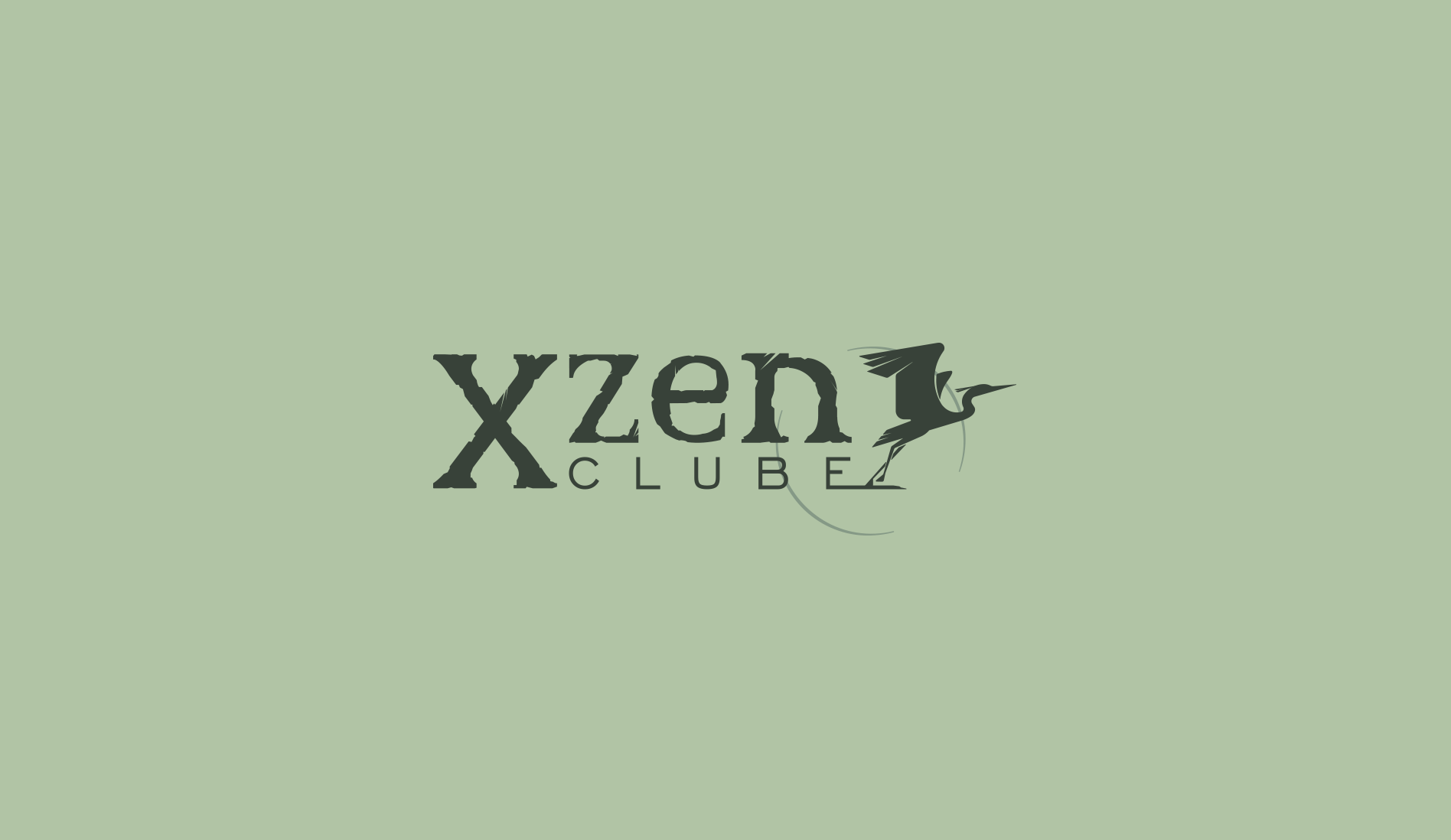
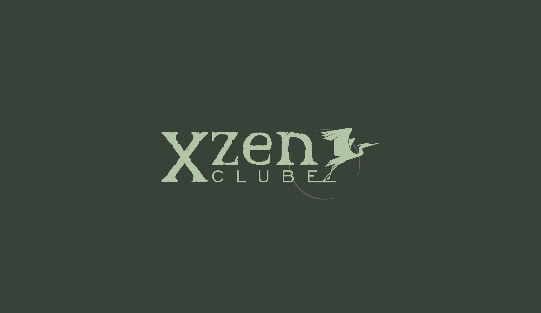
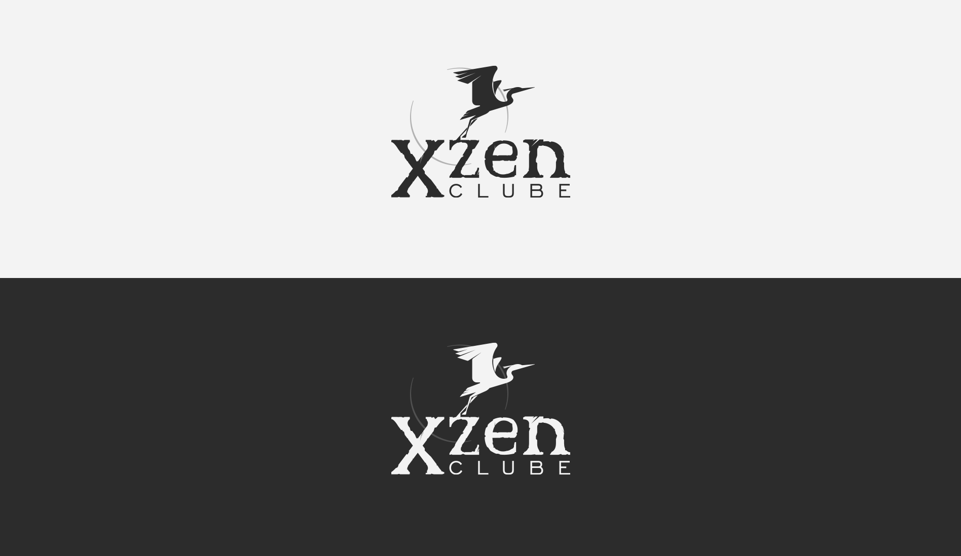
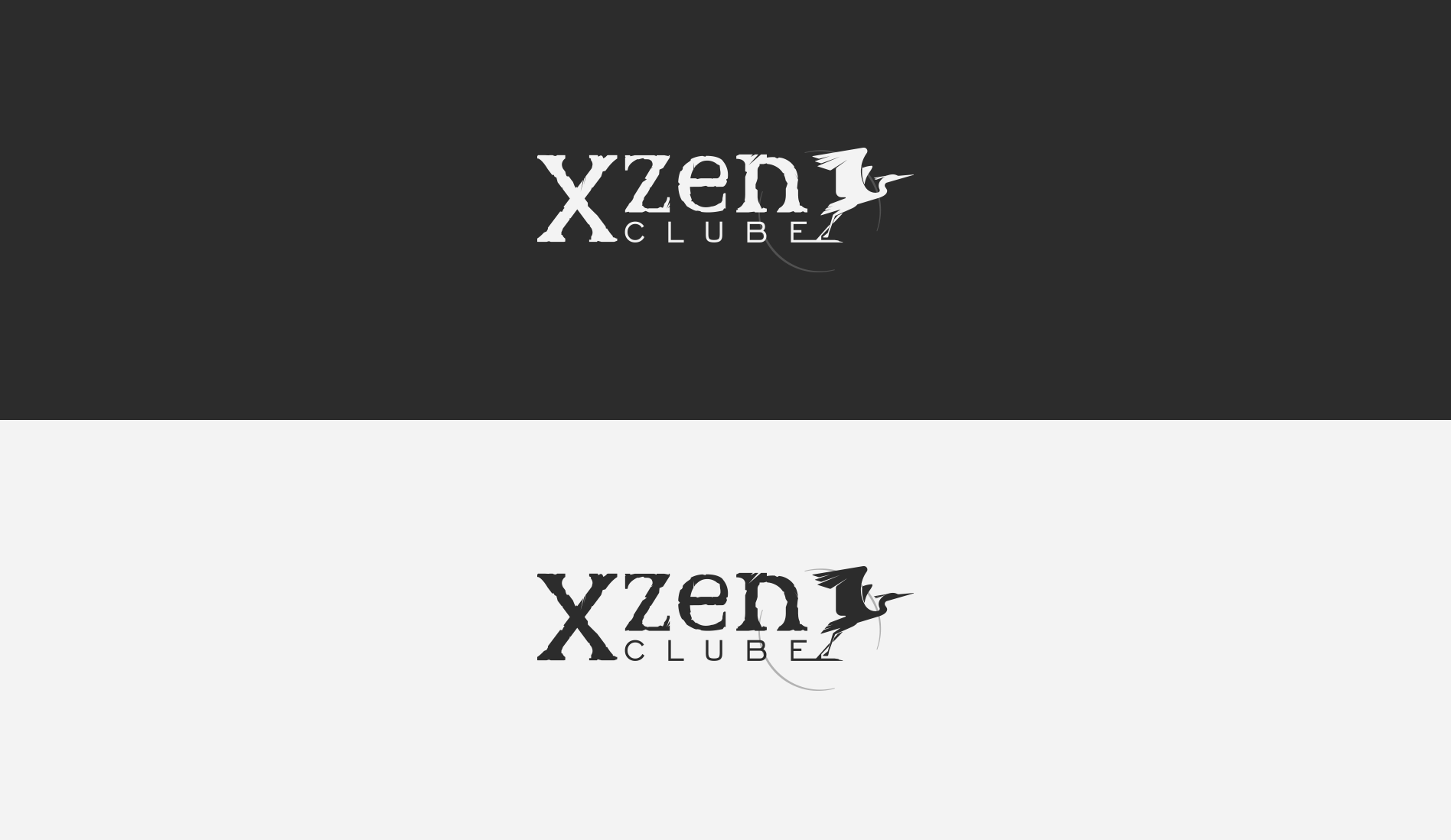
X-zen Clube
- Category: Logos / Branding
- Design Focus: Outdoor Adventure Spirit
- Inspiration: Nature, Freedom, Exploration
- Theme: Youth and Nature Connection
- Project date: November 2019
Ecology School Club
The club connects students with nature through outdoor activities. The pastel green tones capture the essence of the forest, and the heron icon summons freedom and preparation for adventure. The cracked font suggests rocky terrains, while the faint sun, or moon, subtly enhances the connection to nature.
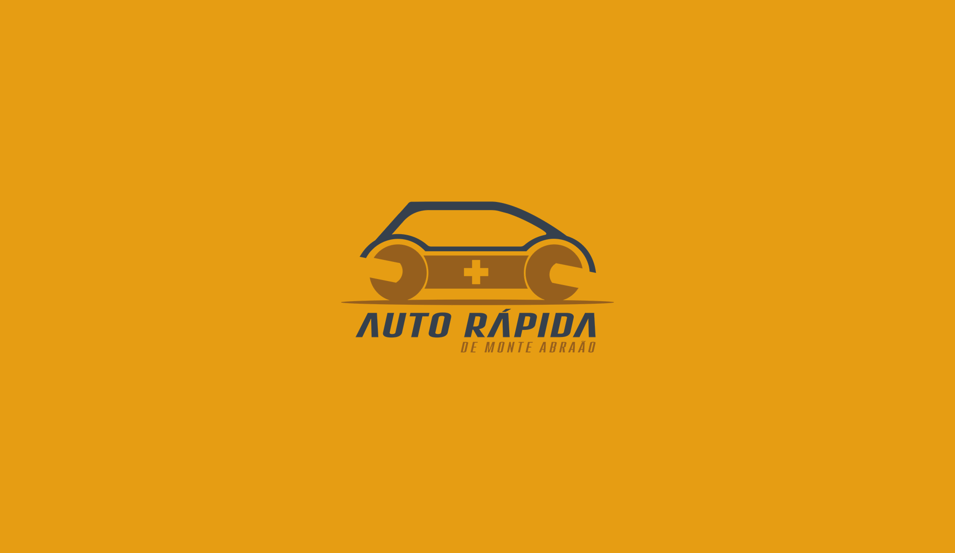
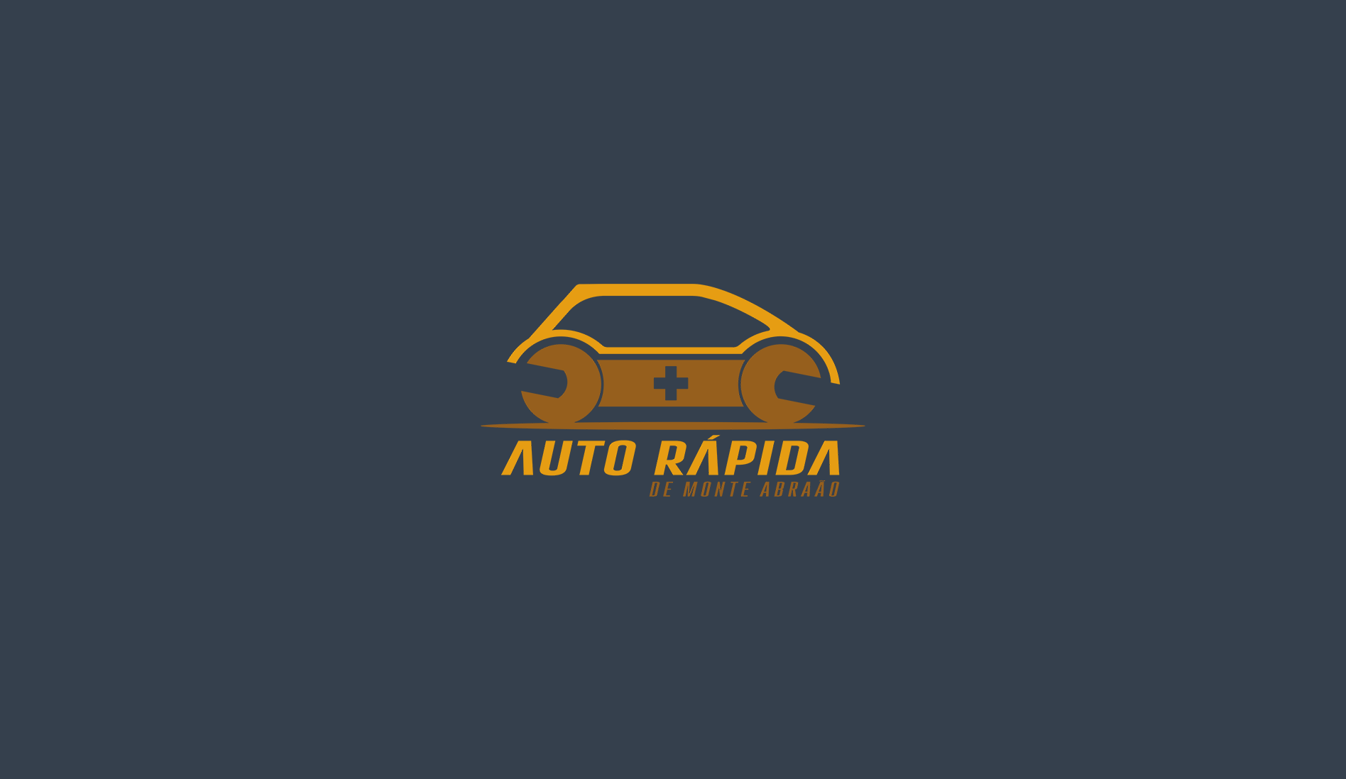
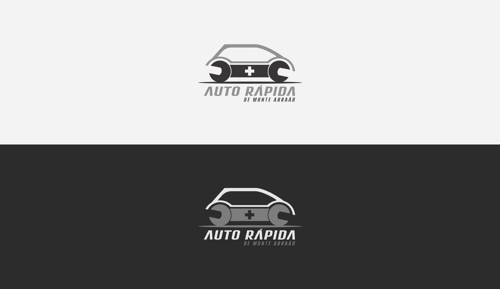
Auto Rápida
- Category: Logos / Branding
- Design Focus: Function and Repair Elements
- Inspiration: Mechanics Tools and Solutions
- Theme: Automotive Service and Reliability
- Project date: September, 2018
Car Repair Shop
The use of a wrench as body of a car, reflect the service’s expertise, giving an idea of mechanicle repair. The bold cross invoke care and quick aid, emphasizing reliability. The yellow and dark blue adds professionalism and warmth, suggesting efficiency and trust, whith a dark yellow bridging the elements.